
Navigation
Install the app
How to install the app on iOS
Follow along with the video below to see how to install our site as a web app on your home screen.
Note: This feature may not be available in some browsers.
More options
You are using an out of date browser. It may not display this or other websites correctly.
You should upgrade or use an alternative browser.
You should upgrade or use an alternative browser.
Color ADVICE
- Thread starter mackfilm
- Start date


HorseFilms
Look ma no hands
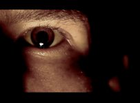
Yeah, I'd probably pull a little of that orange out. What kind of mood are you going for? Creepy?
FallenWyvern
Member
This is just with 2 seconds of photoshop. Pulled down the saturation and played with the levels. Really the question isn't "What do you guys think, is this too orange?" but rather how do YOU feel about it? Ask yourself what you want to achieve with it, then try for that effect. Cold, empty feeling? Tone it blue. Reds and oranges are great for warmth and shadows tell more for your image than any palette ever could (look at film noir for what I'm talking about.)
In the end, there is no right or wrong, as long as you've gotten the effect you're trying for. Read as much as you can about light and color but in the end, it's all you!
That being said, I REALLY like the orange in that image, esp considering it was natural lighting. Very Nightmare on Elm St.
In the end, there is no right or wrong, as long as you've gotten the effect you're trying for. Read as much as you can about light and color but in the end, it's all you!
That being said, I REALLY like the orange in that image, esp considering it was natural lighting. Very Nightmare on Elm St.
Attachments
FallenWyvern
Member
Well I did that so you could compare. I'm glad you decided to stick with the orange. I liked it too!