Candlelight

JimStrauss

Active member
Hey everyone,

I have a scene I'm filming this weekend, doing it with a 7D. The entire scene isn't in candlelight, just a romantic setting at the dinner table. My question is in regards to wardrobe, what colours should I consider my actors wear and what colours would look awful captured by candlelight?

Thank you
J.Strauss
 
Hey everyone,

I have a scene I'm filming this weekend, doing it with a 7D. The entire scene isn't in candlelight, just a romantic setting at the dinner table. My question is in regards to wardrobe, what colours should I consider my actors wear and what colours would look awful captured by candlelight?

Thank you
J.Strauss

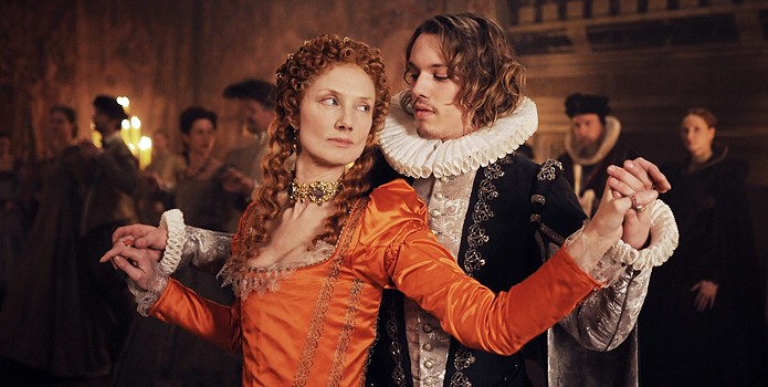
I don't know what the 7D is capable of in low light, but here's a couple of shots from the film "Anonymous"(2011). The DP wanted to maintain the feeling of candlelight through the scenes that relied on 'candlelight' for lighting. I think these shots were all 'supported' candlelight... and not fully lit by only candles.

Shakespeare_Anonym_2012659b.jpg


Another,

anonymous-movie-stills2.jpg


And another,

anonymous-movie-image-joely-richardson-01.jpg


Since candle light and artificial filtered for support, is heavy 'red/yellow', such colors as 'blues' would map darker than in a full spectrum situation. Yellow for me would tend to be 'too much' as the dominant cast is yellow already. The 'red/orange' dress in the last shot 'pops' out, and even the 'green/teal' of the second shot does do some justice to contrasts.
 
Thanks for the help, it means a lot. It looks like browns work as well, what would you think of a dark green or would white or black work?
I have doen research, I have plenty white walls, white table cloth. I think I'll go with your suggestions.

Thank you,
J.Strauss
 
It looks like browns work as well, what would you think of a dark green or would white or black work? I have done research, I have plenty white walls, white table cloth.

Brown is really dark orange, so it should work really well in terms of WYSIWYG. I'd go with a middle green, and expect it to read darker in the capture. White will read light orange in the capture -- it's going to reflect the candle light which is orange. Black will be black, which is fine.

This assumes you'll use a white balance of 3200K. If you white balance to the scene itself, candle light (around 2000K IIRC) will then look white, and your white walls and table cloths will then look white too. Depends on what you want. Do some tests to find out for sure before you commit.

Note that you can increase levels and saturation in post. Make the reds redder, etc. And that means you can have blues and greens, but they may require some work in secondary color correction to make them look the way you want. But... be subtle! A bright blue in a candle lit scene will just stand out as "wrong" and pull your viewers out of the story you are trying to tell and make them look at the technical issues with the picture instead. Which is probably not at all what you want.
 
Back
Top