Calibrite ColorChecker

Peter C.

Veteran
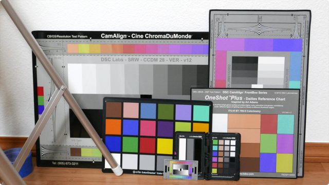
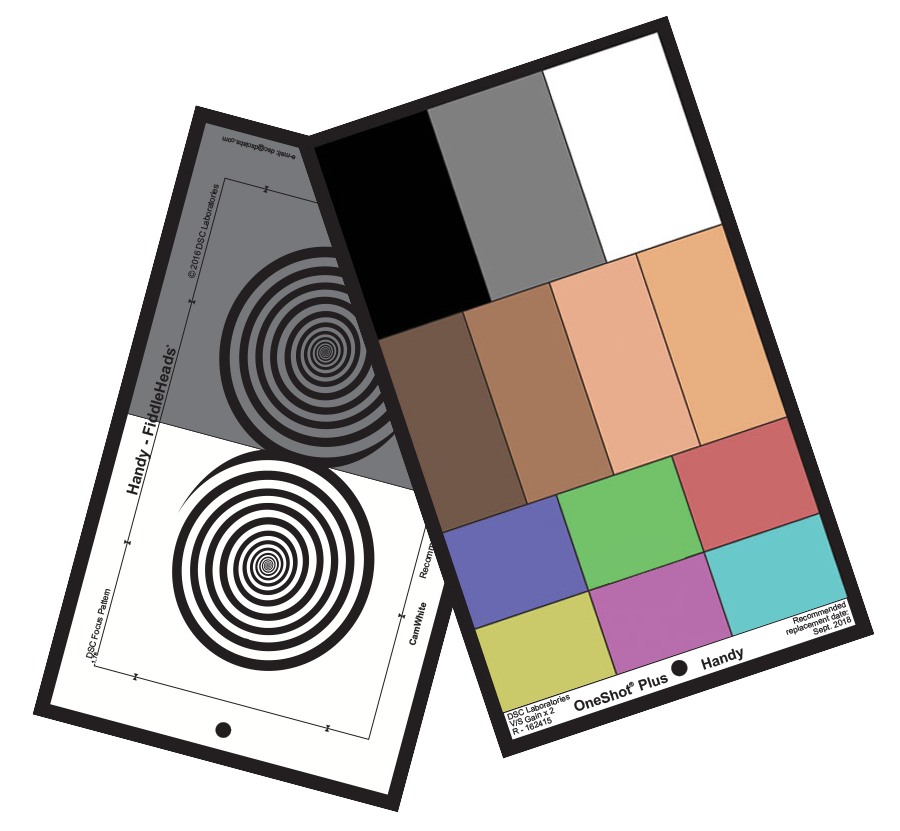
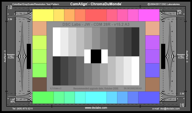
Anyone use them? I saw they're on sale at B&H but still think they're a bit expensive. I usually just grab a white balance off a white card...
I've seen video on how to use them. Seems most useful for film with different brands/types of cameras and getting the color to match. I don't do much of that. Any thoughts...
 
"Not an expert." Just my lay opinion. I bought one about 2 or 3 years ago, just in time to stare at it at home while COVID-19 pooped on my aspirations. I rarely use it because a lot of where I shoot that pays is the same one or two indoor places and conditions. However when I am in new indoor territory I will take the stills and the video samples per the instructions. I only do that as a precaution in case I missed my on site colour settings. Even in the familiar places, if there are unfamiliar objects or strongly coloured walls big enough to possible reflect their tone onto my subject, I'll whip out the colorchecker. All of those calibration shots go into the same respective project folder as the main shoot files, like something I can resort to when my colours go astray (my fault always).

At the ProFusion show in Toronto I took in a half hour one-on-one with the rep from X-rite. Nobody else had the patience to stick around so I got a great personal run through that sunk in. My take away that is paramount is if a person is going to adopt it, get your thinking like this is flight training for your instrument rating. You either trust the method or you don't. The calibrator doesn't care what you think you see. I go nuts seeing all the YT demos where they do everything correctly and then 20 minutes in they blow it by using their eyes to countermand what the software is telling them.
 
I was talking to a colleague who said he got one but never uses it. I've decided I'm not going to get it. Not because I don't think it works but when I thought about it most of my jobs it wouldn't work well. For example my legal video I'm often in a room with mix lighting, outdoor light coming in and changing as the day goes by. In my theater work there are different colored light and you need a larger target so you average it all together. For occasional interviews that's the most likely use case. I watched a Tom Antos video on it, but it's funny after using it he said he prefers to modify it to his own personal tastes. It doesn't negate the use but there are many steps to use it.
I still find it interesting.
 
It's a tool that probably belongs in the professional's kit but I seldom use it. It does have application in multi cam roles, mainly corporate sittings, interviews. Resolve can color match cameras using it. Another seldom used tool for me is the ExpoDisc 2.0, which is a prismatic, frosted 18% lens filter that can be used for both exposure and white balance. The recommended usage is incident, where you stand in the subject position and aim the camera at the primary light source(s). I've used it on event stage with limited success, if you are early, can get on the stage and they are willing to turn on the lights for you, which they are usually cooperative. You only have limited time anyway, and this adds to it. If not you may try it from the shooting position and probably do okay there too. A piece of copy paper, a white table cloth, you'll improvise in all the ways you already do. Or you dial in a WB setting in-camera. Multi-colored stage lights can be problematic, strong red faces, blue faces, fine in person but don't look as good filmed and so I want to level some of it out. I never use them for weddings, but used them for talks, book signings, TedX.
 
I know my reply is late, but here's my list:
  1. Matching identical camera models producing different colors due to variance between manufacturing runs
  2. Matching different camera models or brands
  3. Aligning a hypergamma or cinegamma and accompanying color matrix to the Rec.709 standard
  4. Calibrating a camera's color matrix for better color straight out of camera
  5. Creating a corrective LUT for Flat or Log profiles
Resolve's color space transform has made things easier, and lessened the need to color charts, but they're still handy to have just in case.

Don't forget to correctly set your grey point, white point, black point, and use the color warper to align the patches on the vectorscope. I know there's an auto feature in Resolve, but I don't think it always gets the white point and black point right.

An ExpoDisc (or equivalent knockoff) is very helpful in measuring the correct white balance and tint of fluorescent & LED lights in the 4000 kelvin range. They don't work well with mixed daylight and tungsten light, so you just have to eyeball it and split the difference.
 
Antos was talking about earlier versions of Calibrite's color checkers. As I understand it, their new(er) versions fix some issues...Perhaps the ones that Antos mentions? (I didn't want the whole video):

ColorChecker Passport Video 2

ColorChecker Video (which apparently updates the X-Rite version)

For good general background, check out the webinar Adam Wilt produced in 2016. Yes, there are some new options these days. But this is still good information...and can even help you decide when you don't really need a chart:

Webinar: Test Charts for Production​


I don't always use a chart, but it's a helpful tool... Especially when you want to get product/object/skin colors just right (like for corporate jobs where they want their new widget accurately captured), or if lighting is goofy, or sometimes with multiple cameras or whatever.

I have a DSC Labs OneShot Plus; available in several sizes... Mine is a 10x6-inch Handy size.

It looks like this:
One-Shot-Handy-Front-and-Back2.png


On some bigger jobs (where I'll usually be on sound or something, but not operating or DPing), I still see big DSC Labs ChromaDuMonde charts. They're available to rent around here for about $30/day with a stand. Totally cool, but totally beyond my needs.


ChromaDuMonde28R.jpg
 
(like for corporate jobs where they want their new widget accurately captured),

Exactly - when doing actual work for clients :)


Bore your self sensless here as I wander through a card :)

 
On some bigger jobs (where I'll usually be on sound or something, but not operating or DPing), I still see big DSC Labs ChromaDuMonde charts. They're available to rent around here for about $30/day with a stand. Totally cool, but totally beyond my needs.

I have a ChromaduMonde chart and it's still the gold standard in the broadcast world for setting up cameras, matching camera, creating scene files, etc., so long you also have a real vectorscope and waveform monitor at your disposal. Fortunately, I have a Leader LV5330 waveform/vectorscope that works great with the ChromaduMonde. If you've never had the opportunity to work with real charts and scopes you might be surprised at what they can tell you.

I slso have a portable X-rite colorchecker chart that I never use for anything. :)
 
I've used them just a bit in the past - and have friends in the business (most from still photo backgrounds) who use them on every single shoot they do - which I think is a bit overkill.
While I use to think - for color critical things, such as interior colors of kitchen cabinets, when the cabinets are essentially the star of the video, they were essential to get the grading "spot on", over the years I've come around to realizing/understanding one important thing:

We all see color distinctly individually. Your optometrist / ophthalmologist can confirm this. (maybe not so much with YT compression - but certainly when looking at paint color chips in your local paint store) So, if everyone who replied in this thread is looking at the same chart, there may be 12 different subtle varieties on the tints of certain colors we see. So, the chart becomes a starting point - but then if the client sees that chart a bit differently than I do, even when I've done everything right setting my camera to match it - as Sam demonstrates nicely in his video above - suddenly their "warm Taupe" or "sage green" cabinets are a bit too brown or gray in my final shots in their opinion (and let's not even start the topic about what monitor they are looking at - or let's not forget how some colors look differently in direct sunlight than they do in shade) So then I end up grading to "taste" after the chart calibration anyway. Much the way, in Sam's video demonstration, he says "I feel this is a bit blue"...the waveform may show you this - but at the end of the day, there are plenty of times the grading is done for "feel" or to set a "mood", etc.
Correctly white balancing your camera, especially in changing environments, is very under-rated (and maybe is "old school" now??). I've seen people use charts but not bother to white balance the camera in the same lighting as they shoot the chart.

When using multiple cameras - of different models / makes...
1. Camera Lens rentals is your friend. Why not use the same 3 models?
2. If you can't do 1, CineMatch (or similar software) is also your friend.
 
Thx Jim and all who replied. I’ll check that info out. Tom Antos video wasn’t so much a review. The only complaint he made was for both that you have to tilt it to prevent reflections. The dsc labs swatches are different sizes making alignment more work and it’s size and lack of protective case more suitable for studio work. Beyond expense they seem a bit fiddly and prone to damage. I think if I start filming in log could be useful to have base to grade from.
 
Last edited:
I haven't had those issues with the DSC One Shot.

The One Shot swatches are different sizes by design. The left row gives you grey scale, the middle gives flesh tones, the right gives standard (and accurate) 709 primary and secondary colors. They all line up with scopes rather well.

And if you roll with DaVinci Resolve, there's a SMPTE One Shot preset in the Color Check feature, which makes it really easy to get to a good starting point (or final if you're in a hurry). IIRC, the preset is for the smaller (big pocket sized) SMPTE One Shot, but you can resize it to fit the larger sizes. And for me, I'd rather have a few bigger key swatches rather than a whole lot of tiny (and not always accurate) swatches. Requires less zooming in...

Here's an old article by Art Adams, who designed the One Shot, explaining his design choices:

I don't find the chart fiddly at all, and mine has held up well. I keep it in an older zipped laptop slipcase along with a white card, grey card, and dumb slate. Not a problem. And ya, I use it out in the field, not just in studios. And I'm not especially careful... neither are the Acs and PAs who end up holding the charts.

Check out the Adam Wilt webinar.... Around 19:30 in he makes a couple of recommendations.

I find charts useful, and I've found the One Shot to be a good simple middle ground between the small clamshell charts and the larger charts.

=== Let me add, just to be clear: No worries about different opinions Peter. ===
 
Last edited:
Back
Top