
Navigation
Install the app
How to install the app on iOS
Follow along with the video below to see how to install our site as a web app on your home screen.
Note: This feature may not be available in some browsers.
More options
You are using an out of date browser. It may not display this or other websites correctly.
You should upgrade or use an alternative browser.
You should upgrade or use an alternative browser.
DOC: British Comedy Documentary - vintage VHS look
- Thread starter richg101
- Start date

Egg Born Son
Veteran
VHS look is pretty good, particularly the colours. I like that you didn't go the VHS distortion route. That look is the result of copy of a copy or tired old tape. VHS looked pretty good directly off a fresh new master tape. Especially betamax. The giveaways are the resolution and the super font is more of a mid-nineties onwards look. The logo at the front end is good too.
Derek Chingwell
Well-known member
Background's clothing doesn't match 1980's style... the talent's tie clip mic doesn't seem early 80's either.
Nothing was 16X9 back then (let alone HD) - and all titles would have been TV safe (needing a lot more safe title than you've given).
What you need is to add some vertical CCD smear
Nothing was 16X9 back then (let alone HD)
- and all titles would have been TV safe (needing a lot more safe title than you've given).What you need is to add some vertical CCD smear
Egg Born Son
Veteran
Oh yeah, I didn't pick up on the 16:9. I've gotten so used to it. Digital only really began to come into it's own in mid-nineties so the clothing can be forgiven (it doesn't draw attention to itself as modern) and the people in the background can only be controlled so much. The lavalier I don't know, they've been around for a long time but I think the icecream microphone was definitely prevalent in the 80s, can't really remember for the 90s. Certainly the back half of the nineties were a misbehaving blur, there's something of a hole in my memories for my first half decade of being drinking age. About all I can remember is that I think it was fun. Messy but fun.
hahaha. cheers for the feedback guys. There are lots of flaws I know. though I think the ecm55b mic was around in the 80's. 16:9 vs 4;3 is the main issue I think. thanks for bring it up. means it is worth me going in a redoing the titles and credits to fit a 4:3 crop. how would I create the vertical ccd spear? any suggestions?
my workflow was as follows:-
work a 1080 25p timeline and colour correct so saturation, hue and contrast are about right.
export as 480p high bitrate
re import and upscale the 480p to 1080p
apply a 3px gaussian blur then sharpen back up again
export out as 1080p and upload to vimeo
any other suggestions?
Egg Born Son
Veteran
The CCD smear is caused by bright light sources, largely absent in your work. Maybe in some of the low angle shots with sky poking through the details of the church but it might be a fudge to include them. Here are a couple of images off google:
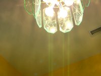
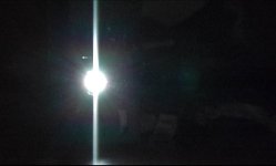
I thought the colour treatment, slight softening and chromatic abberation looked fantastically nostalgic, that was what I was immediately struck by. As far as it still looking hi-def, maybe back off on that final sharpening, or do your upscale after the gaussian blur/sharpening. Or maybe your NLE is doing too good a job of rescaling it to 1080p. Another thought, maybe export it as 480i? Or leave it in 480i/480p? It looks good in 1080p to be sure and is fine as is but I don't think that is what you were going for.
For the font choose something that isn't truetype/vector based as your source. The Arial looks too clean and sharp. Maybe add it with a lower resolution than the image. I remember text titles being often inferior quality to the image, I suppose due to computers being what they were. The logo at the front looks about right to me, try and emulate that look. Of course all this is coming from a faltering memory. Going by feelings more than brain!
Can't help you on correct TV safe margins. Might have to google that.
Derek Chingwell
Well-known member
It would also be interlaced too - 25i... yuk - shudder at the thought
On the Pal TV safe - you should have that in your NLE settings. Start a project in Pal and put your guides on - there used to be title safe too.
You could go the whole way and reformat 4:3 for the video - just put black bars on the side. This would help it achieve an authentic feel... but might be going too far!
Check out the modern spoof of 70's/80's TV science programs 'Look Around You' - that'll give you some good reference on looks/tiles and the scary world of the 80's (a world, I am gad to say, I survived!).
It would also be interlaced too - 25i... yuk - shudder at the thought
On the Pal TV safe - you should have that in your NLE settings. Start a project in Pal and put your guides on - there used to be title safe too.
You could go the whole way and reformat 4:3 for the video - just put black bars on the side. This would help it achieve an authentic feel... but might be going too far!
Check out the modern spoof of 70's/80's TV science programs 'Look Around You' - that'll give you some good reference on looks/tiles and the scary world of the 80's (a world, I am gad to say, I survived!).
cheers for the response. 'Look around you' has been brought up by fellow film makers I am local to who have given critique. 4:3 it is! i'm going to do a crop, maybe a horrible interlace export and re-import. trying to work out how to add a bit of ccd vertical bleed.
As a Uk based person, how would you critique the overall flow, the subtleties of the humor? etc? does it work?
Derek Chingwell
Well-known member
I'm in the middle of a bit of a nightmare deadline (editing and doing CGI)... so I'll watch again with a fresh eye soon.
At the moment I'm at that stage were all that could be going wrong 'is' going wrong - mainly because I'm tired (and grumpy!) - so not the best time to give useful critique!
At the moment I'm at that stage were all that could be going wrong 'is' going wrong - mainly because I'm tired (and grumpy!) - so not the best time to give useful critique!