Black Friday Specials

Just the 8GB models.

puredrifting, if you want one at max specs, you should wait until next year, when the 16" Macbook is expected with 12 cores (8 high-speed, 4 low-power) and probably 32-64 GB RAM at least.

$899 for a fanless little Macbook Air, that runs circles around most other machines, is a sweet deal, if you're looking for a portable little rocket.
 
Part of the problem was the staging/directing of the extras

ahalpert, I agree the lighting wasn't ideal, but I'm with Norbro that it was par for the course with news lighting.

Well, at least with impromptu, handheld interviews. You know, the camera has a spotlight, and they just turn it on. As far as beauty, it isn't the best choice, with the flat frontal lighting and much dimmer background. But it's fast and good enough.

Here, I would have thought they had more time to set up something more nuanced, but for whatever reason, they didn't take it. Whether it was lack of skill, gear, or time, who knows?

But if you're talking about the comment about it looking like a "haunted diner," I would say the problem is mostly because of the staging of the extras. Many restaurants are at least as dim. It's everyone staring at you that's eerie. Plus, I think they're supposed to be conveying some kind of indignance?

nonactors +
try to look composed +
but also try to look mad +
weird setting for everyone facing forward (would have been better if they were all just standing outside or in some other less casual setting)

Anyway, with this setting, it might look "haunted" regardless of the lighting :)
 
puredrifting, if you want one at max specs, you should wait until next year, when the 16" Macbook is expected with 12 cores (8 high-speed, 4 low-power) and probably 32-64 GB RAM at least.

$899 for a fanless little Macbook Air, that runs circles around most other machines, is a sweet deal, if you're looking for a portable little rocket.

That's what I'm thinking, 16" MBP with 32-64GB as long as it doesn't cost a fortune. I am still using my 2011 MBP, which is now an antique
but's still useful for downloading media and doing laptop things on sets and when traveling. This means I tend to take care of my laptops
and if you can get a decade out of one, then $4k isn't outrageously expensive. I don't tend to not edit much on laptops though as it's a highly sub-par
experience compared to my 27" iMacs

So then why would you want a more expensive MBP and not one of the available M1s if you can currently get by with a computer you've had for 10 years for only downloading media and doing laptop things on sets?
 
ahalpert, I agree the lighting wasn't ideal, but I'm with Norbro that it was par for the course with news lighting.

Well, at least with impromptu, handheld interviews. You know, the camera has a spotlight, and they just turn it on. As far as beauty, it isn't the best choice, with the flat frontal lighting and much dimmer background. But it's fast and good enough.

Here, I would have thought they had more time to set up something more nuanced, but for whatever reason, they didn't take it. Whether it was lack of skill, gear, or time, who knows?

But if you're talking about the comment about it looking like a "haunted diner," I would say the problem is mostly because of the staging of the extras. Many restaurants are at least as dim. It's everyone staring at you that's eerie. Plus, I think they're supposed to be conveying some kind of indignance?

nonactors +
try to look composed +
but also try to look mad +
weird setting for everyone facing forward (would have been better if they were all just standing outside or in some other less casual setting)

Anyway, with this setting, it might look "haunted" regardless of the lighting :)

usually, there is overhead lighting in a diner. which creates local contrast everywhere and shadows coming from above, and splashes light on walls creating gradients. it would have been better, in my opinion, if they had left the background as it normally were and just added their lights on the man speaking. which is often what happens in news capture.

but this wasn't normal news capture. this was a nationally broadcast live speech with a huge audience and plenty of time and money to set it up. they clearly lit him, it was not just an on-camera spotlight.

and my reaction to it looking unnatural and crappy happened upon first seeing it, before hearing any punditry.

and comparing it to the modern family commercial filming scene - which has less of a contrast between the main subjects and the background - is what some other commentators did, comparing the speech to a cheap TV commercial. which look cheap in part because they are obviously and unevenly lit

 
they clearly lit him, it was not just an on-camera spotlight.

Agreed. They used a bigger light but the same approach. Now that I look at it, it looks like they even lit the background, just probably with some simple bounce off the ceiling.

I'm sure that many here could have done better with the same time and gear.

But when I started to watch it, I was overwhelmed by the awkward vibe that just floods in from the people behind him.
 
I've been shooting network live shots and talkbacks for over two decades. Before cellphones/skype/zoom became viable alternatives, I usually did several a week. Sometimes I only put up a key(or key and silk)(if outside) or key(s) and hair and worked with the ambient/existing/natural light. Other times if I had complete control and time, I'd use easily five to seven or more.

Would I have lit it like this and been happy? No, probably not. But this isn't "high art". It looks like a LS/talkback and not out of the ordinary, today. Even at the network level. Unfortunately, standards just are not as high as they once were. A lot of producers and directors on live shows are just happy to get an image with the subject half-way exposed properly and reasonably clear sound today.

I'm not defending, justifying or endorsing it in any way. I'm just saying what it is. And "it is what it is".

Now, I feel that I've always had reasonably high standards for even the mundane LS that a lot of people look down upon, and mine were usually one of, if not the best looking shots, in a given show that I was in, because I cared. There were times I'd receive text messages from the show producer, before even getting on heads, asking if I was shooting 'live shot X' that day. When I'd reply "yes", they'd say they knew it when looking at the monitor bank of the shots, because they knew my "look" and my style.

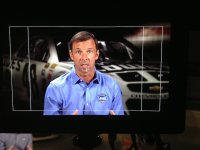
An example of putting forth a little effort and doing more than just pulling out an LED panel or two and calling it a day. Seven lights, 6.5 years ago, two man crew and a real broadcast ENG camera. Today these kinds of things are regularly done with the subjects cellphone or laptop.

LS.jpg
*obviously this is a cellphone pic of a monitor. the real shot looked better*
 
Agreed. They used a bigger light but the same approach. Now that I look at it, it looks like they even lit the background, just probably with some simple bounce off the ceiling.

I'm sure that many here could have done better with the same time and gear.

But when I started to watch it, I was overwhelmed by the awkward vibe that just floods in from the people behind him.

It's possible that I'm conflating how I feel about the lighting and how I feel about the acting. But the two play off each other and contribute to the zombie feeling.

I can read a series of decisions following a playbook that contributed to the awkwardness. Like - we'll turn off all the interior lights because the color wont match, and that's what we do. We'll leave a space directly behind his head free from extras so we dont have any overlap even though it creates a halo of void in the crowd around him. We'll light him the standard way we light interviews and light him much more strongly than the background that we weakly filled so we can keep our ISO and noise levels down on this camera.

There just isn't a sense of an aesthetic gestalt that was carefully thought out. And the result clashes with the message of the propaganda - which was, "I'm a normal guy, sitting in a normal diner, surrounded by normal people just like you."

Of course, I dont watch TV news, so I may be less used to the aesthetic. Either way, it's a failure.

I've been shooting network live shots and talkbacks for over two decades. Before cellphones/skype/zoom became viable alternatives, I usually did several a week. Sometimes I only put up a key(or key and silk)(if outside) or key(s) and hair and worked with the ambient/existing/natural light. Other times if I had complete control and time, I'd use easily five to seven or more.

Your shot looks very nice, Run&Gun.

But I think there's a misunderstanding about my critique of the Beshear shot. I don't think it should have looked like a Hollywood film. I think it should have looked like a diner to your eye, perhaps with brighter, more flattering light on Beshear.

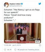
Here's another widely mocked political speech that failed in the opposite direction, by trying to be too cool.

Here, I think the lighting is totally fine. The surrounding hallway is a little dimmer, but totally acceptable. The lighting is a little hard, but not unflattering.

The weird thing is - why do they do this big zoom move from a wide shot to a medium? Totally unnecessary, and draws our attention to the rest of the hallway that is not filled with flags.

And then why are they standing so close together? To share a podium? To fit in 4:3? There are more naturalistic ways of staging it to solve those problems.

Then, lastly, the acting is about as bad as the extras in the diner, and drew comparisons to American gothic.

But both speeches should have simply tried to look more normal and drawn less attention to how they were filmed.

 
It's possible that I'm conflating how I feel about the lighting and how I feel about the acting. But the two play off each other and contribute to the zombie feeling.

I can read a series of decisions following a playbook that contributed to the awkwardness. Like - we'll turn off all the interior lights because the color wont match, and that's what we do. We'll leave a space directly behind his head free from extras so we dont have any overlap even though it creates a halo of void in the crowd around him. We'll light him the standard way we light interviews and light him much more strongly than the background that we weakly filled so we can keep our ISO and noise levels down on this camera.

There just isn't a sense of an aesthetic gestalt that was carefully thought out. And the result clashes with the message of the propaganda - which was, "I'm a normal guy, sitting in a normal diner, surrounded by normal people just like you."

Of course, I dont watch TV news, so I may be less used to the aesthetic. Either way, it's a failure.


Your shot looks very nice, Run&Gun.

But I think there's a misunderstanding about my critique of the Beshear shot. I don't think it should have looked like a Hollywood film. I think it should have looked like a diner to your eye, perhaps with brighter, more flattering light on Beshear.

Here's another widely mocked political speech that failed in the opposite direction, by trying to be too cool.

Here, I think the lighting is totally fine. The surrounding hallway is a little dimmer, but totally acceptable. The lighting is a little hard, but not unflattering.

The weird thing is - why do they do this big zoom move from a wide shot to a medium? Totally unnecessary, and draws our attention to the rest of the hallway that is not filled with flags.

And then why are they standing so close together? To share a podium? To fit in 4:3? There are more naturalistic ways of staging it to solve those problems.

Then, lastly, the acting is about as bad as the extras in the diner, and drew comparisons to American gothic.

But both speeches should have simply tried to look more normal and drawn less attention to how they were filmed.


See...it's a you problem again.

The shot is perfectly fine out of hundreds that have looked the same through history for this type of content.

(And you appear to have this complex about people being too close to each other when it's like this time and time again in video production.)
 
I think this is the 7th time now I'm hearing about this CineMatch discount. lol

Who's being paid and how much? I want in, ha
 
See...it's a you problem again.

The shot is perfectly fine out of hundreds that have looked the same through history for this type of content.

(And you appear to have this complex about people being too close to each other when it's like this time and time again in video production.)

...so your argument is that all TV news looks like **** and therefore I shouldn't criticize it for failing to achieve its emotional objective?
 
...my argument is it looks a certain way and has failed to YOU.

Again...I wasn't the only one

Screenshot_20201127-181017_Chrome.jpg

Most of the mockery directed at the shot addressed their demeanor. But, again, the staging and framing contributes to that perception.

https://www.cbsnews.com/news/schume...ss-becomes-instant-meme-sensation-on-twitter/

And yeah. It did fail me. Do you truly think it was effective propaganda?

They definitely should have used 3 cameras and cut between a wide and 2 close-ups. I have no idea why they wanted to do it all in one take on one camera, maybe to imbue a greater sense of realism and immediacy.

Oh wait - am I not allowed to analyze that obviously very deliberate thought process? It was all probably accidental and random, right?
 
Everything is a meme, and everyone is a critic.

All it takes is for anything to go viral and plenty of fools reflect: "YES, YES, I agree!!! That's terrible!" ...or... "That's right. That's the best ever!!!"

Watch more news or the history of video production to understand that this is an art which has had hundreds of thousands of creative choices over the last 100 years because people are different.

For the record, I am not saying this is HOW it should have been, but that this is one choice that someone made and it works perfectly fine.
 
Back
Top