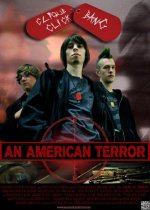
FEATURE: An American Terror

Jim Brennan

VHS Member Old Skool
Hey folks. Sorry to have been absent from the boards for awhile. Been working on a few projects, including the one I am posting about. It's a feature called An American Terror. We shot it in June on a Red One and a Scarlet using Red Pro Primes. Our DP was Anton Fresco and the Camera Op was Ken Hendricks (khendrix2 on DVXuser). I executive produced and was the AD. It was written and directed by a Denver-based writer named Haylar Garcia. We shot everything in Colorado. The project has been very hush-hush, so I couldn't say anything about the development here, but as we wrap things up I will be able to discuss more details.

That being said, I wanted to post a link to the Teaser. We are still a month or so from wrapping post, but we wanted to get this out on the web.

http://www.youtube.com/watch?v=xN5zX58kS04&feature=youtu.be

If you have any questions or comments,throw them out there.

Thanks guys. It's nice to be back. :)
 
the footage is much better than the "editing" and the 'beat'. the tempo/rhythm is not right, the audio side is empty and monotone, what did you think?
 
Thanks for the feedback Amr. Since you asked, I will say that the audio is empty, and that is intentional. The rhythm is supposed to be off kilter because that is what the teaser is meant to feel like. You are supposed to be put a little off by both the images and delivery.

But of course the theory does not always work. While we want the teaser to be a bit unsettling, we also want people to watch it. SInce 105 people have currently viewed this thread, and you are the only one to comment, I have to wonder if we missed the mark.

Thanks! :beer:
 
I was one of those 105 who didn't comment because it was hard for me to come up with something I think you could take without feeling picked on. It just didn't work for me at all. Lots of wasted time on the opening shot that doesn't translate. The stunts all seemed like staged stunts. It was all visually too dark. Here and there darkness works to differentiate a scene, but all of your interiors were just really dark. The scene with the three silhouettes felt staged and artificial. Dialog quality at the end sounded pretty raw. Music that hits in perfect rhythm with the visuals plays as pretty on-the-nose. And starting with the green pretend MPAA screen doesn't help your cause.

You may have a compelling story in there, but I couldn't find it. I didn't like any of the characters I saw, and I wasn't interested in seeing more.
 
the footage is good enough for a solid trailer, the teaser is not doing it justice. i am not trying to put it down or anything.

but the cuts are not even frame accurate to the 'half beat' it seems. i watched it again, there is about 40 seconds of nothing out of 1:14, with a pointless cross fade in the middle?!! and the cuts are not to the 'beat' but the higher pitch instruments and they are late and off. and the music does not seem to fit. there is a reason why their is music and sound fx in trailers (some times dedicated to the trailer)and why people use fade to black.

what about a simple trailer 2:30 minutes, introducing the setting, some of the characters, part of the problem, and ramp up the rhythm through part of the 2nd act struggle. all it needs is a good composer. it will still not reveal much of the story, but would be a more professional looking trailer.
 
I really hope it didn't come off as rude, but I can see how my comments could be viewed that way. Certainly wasn't my intention.
 
Not at all. We're all grown ups. How can we have an open discussion and learn how to improve without letting each other know how we see something? Both of your comments were specific and thoughtful. They weren't personal attacks.

Have I been gone that long? I can remember leaving this board bleeding at night :grin:
 
Closing in on 3K hits in just a few days. I am getting the impression that people are a bit put off by the content.
 
The 1st half seemed somewhat amateurish, however the trailer really picked up once the jock punched the nerd. I'd watch this movie. I recommend cutting a more traditional trailer though.

Good luck with this.
 
well I think its great stuff

great title

internet age= start with your strongest material hook em fast so they dont click away

open with the explosion screw that

anyways it looks well shot, I hope the director brought an original voice to the idea could be a llil one-note otherwise

LOVE the title/graphics if you can go a lil more wierd/unusual/clever with the vibe of the whole trailer I for one would dig it more- Im an exploitation horror fan so Im your audience- show off the wierd in there!

anyways good luck with it looks great
 
Last edited:
Ok, the 2nd trailer is VASTLY better than the first one. The teaser trailer did nothing for me, but the sales trailer was actually quite good. I can definitely see this having an audience.

My biggest gripe with the film, is that personally I find the color timing on the daylight exteriors to be gross. Basically the first half of the trailer looks like it had an instagram filter on it. I am sure this was an intentional decision, and there very well could be a lot of people who dig it, but i'm not one of them.

on the whole though, cool stuff. good luck with getting this out there!
 
Thanks guys. yeah, I can see that about the exteriors. It was intentional and I think it works stylistically in the context of the film as a whole, but I can see it seeming off out of that context.

Appreciate the feedback!
 
Missed this thread before.

Definitely agree that the 2nd Trailer is more effective in conveying what the movie is and certain can see why the response has picked up as it certainly looks to fit that genre nicely where the 1st one did not.

Good luck with it.

-M
 
Back
Top