
Navigation
Install the app
How to install the app on iOS
Follow along with the video below to see how to install our site as a web app on your home screen.
Note: This feature may not be available in some browsers.
More options
You are using an out of date browser. It may not display this or other websites correctly.
You should upgrade or use an alternative browser.
You should upgrade or use an alternative browser.
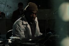
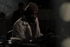
what do you think of this lighting?
- Thread starter deadby23
- Start date

Jon Starr
Veteran
It's not bad. Good over-all. Although the light is a bit too harsh for my liking though (the strong lined shadows on his jacket).
The edge light is very dominant making it look stylized when the other lighting and over-all production imply a more natural tone. Feels like a clash in approach.
Just my 2 cents.
The edge light is very dominant making it look stylized when the other lighting and over-all production imply a more natural tone. Feels like a clash in approach.
Just my 2 cents.
It's not bad. Good over-all. Although the light is a bit too harsh for my liking though (the strong lined shadows on his jacket).
The edge light is very dominant making it look stylized when the other lighting and over-all production imply a more natural tone. Feels like a clash in approach.
Just my 2 cents.
Thanks. So do you think kicking up the fill on the left side to take some of those jacket shadows away and diffusing the backlight will help make it seem more natural?
Homunculus
Carbonite Member
i see his point i guess it depends what you're going for. if this is a music video (stylized) then it's good. if this is a movie that's supposed to hvae naturalistic lighting then that kicker light is a bit too grating and needs to be diffused
I like it. I like the edge light too. I like that the key is on the short side of the face and you're not afraid of the darkness on camera left. I like the nose shadow indicating that the key height is about right. I like that the key is to the side. I like the range of tones from white to black. I like the catchlights in the eyes. I like that the background is darker (and softer).
The only thing I don't like in this frame is that big out-of-focus thingie on the right. If you dollyed into to there I might feel better about it but in this static frame it moves my eyes over to study it instead of merely adding some visual texture while I look at the actor. If you love it take some light off it.
De gustibus et coloribus non est disputandum.
Oh, and if someone asks, "But where does the light come from?," tell them from the same place as the music. (A great line shamelessly stolen from someone's sig.)
j1clark@ucsd.edu
Veteran
For me, the dark side of the subject's face is just plain too dark. There needs to be something that gives a little definition to his jaw line. If this was a moving picture, the fuzzy object on the right could be 'explained', but as a still it add clutter.

William_Robinette
Shallow Member
I think this is great. Thank you for not being afraid to throw a hard, non-diffused light onto someones face.

I guess im going for a somewhat "natural" look. The setting itself is a makeshift laboratory in a basement. We wanted the lighting to make it seem as if our main character who works in the lab just threw the lights to see what he was doing but at the same time i needed it to look cinematic. So we hung a few work lights from the ceiling and pointed them in directions that allow it look practical like the character did it as well as have some good cinematic value.

Image itself looks good to me, considering what you were trying to achieve.
Theres also a bunch of artifacts in different places telling me you had to push it to get this far.
Theres also a bunch of artifacts in different places telling me you had to push it to get this far.

Postmaster
Dark Side of the Camera
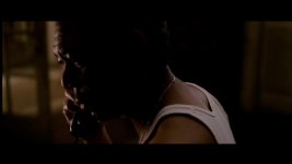
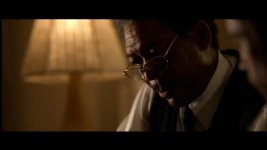
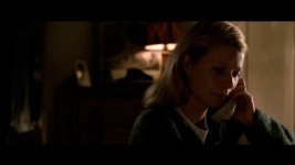
Try to get the hard light at the opposite side of the camera. They did that in Se7en a lot.

bruce southerland
Active member
Looks good!

Jordan Scott Price
Veteran
I really like this. Dude's got blue hands!
If you're going for a home-mad basement lab setup, you could probably take some light off that back right wall - not a lot, just maybe a stop. I feel it might be more motivated if some of the background fell into darkness, but it still works this way. Huge props to the depth you created with the dark-light-dark-light pattern from his face-to-shoulder-to-other-actor-to-wall.
If you're going for a home-mad basement lab setup, you could probably take some light off that back right wall - not a lot, just maybe a stop. I feel it might be more motivated if some of the background fell into darkness, but it still works this way. Huge props to the depth you created with the dark-light-dark-light pattern from his face-to-shoulder-to-other-actor-to-wall.
Jordan Scott Price
Veteran
At that point, any critique is a matter of taste.
+10^10
Image itself looks good to me, considering what you were trying to achieve.
Theres also a bunch of artifacts in different places telling me you had to push it to get this far.
what do you mean?
Pietro Impagliazzo
Well-known member
How are you going about that green tint? How are you gelling your lights? What about color grading? Curious, since I like the look.
Regarding artifacts (Noel commented), I can see chromatic abbreviation on some objects near the CD, on the highlight edge on the guy.
Regarding artifacts (Noel commented), I can see chromatic abbreviation on some objects near the CD, on the highlight edge on the guy.
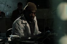
Thats it.
I also dont like obsessing over a still image as this is motion we're dealing with. I can pick still frames from any movie and if presented you might thing what? But it could be a transision shot walking from light to light etc.
I also dont like obsessing over a still image as this is motion we're dealing with. I can pick still frames from any movie and if presented you might thing what? But it could be a transision shot walking from light to light etc.
Pietro Impagliazzo
Well-known member
View attachment 27267View attachment 27266
All i did was color it.
I see what youre talking about now. Right on the top of his shoulder,near the cd, and the top of the chair right?
What are you using for color correction? What kind of adjusments did you make?