Upping my Photographic game

Doc Bernard

Indie Arms Member
I am venturing into headshots. First round, tremendously disappointed with my results. This round, I am much happier, as was the client. Took a lot of studying people's headshots to see framing and composition.

I am good with this:
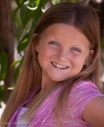
IMG_7229-2.jpg
 
Shade is king - you've got that right.

Id say shes turned too much. 'If you don't feel comfortable you wont look comfortable' Her feet are at 3 o'clock to the camera, maybe try 1 to 2 o'clock, but not midday!

Also the BG is a little heavy in the shot, maybe open up or move the subject off the background.
 
A couple of items.

Since I presume the girl is about 12-13 or so, perhaps there was a desire to avoid 'makeup', but she does have a bit of dark under the eyes. Could be 'improved' with a bit of photoshop.

The other item was the single hair crossing her face...

In this case, this is perhaps one of the situations were I would use shallow DoF to fuzz out the background. Otherwise a more neutral background would be better. Perhaps again some photoshopping to 'darken' the background while maintaining the girl's tones would separate more.

I also agree that the post looks a little to 'twisted' and gives the impression of stress. The girl's neck kind of gives that impression. Yet more PS to soften the shadow that the neck muscle(tendon... whatever... there's a reason why I never became a doctor...) has.

The Wife would always have the model look slightly above the camera but straight down the lense, she would point to her forhead for the model's eye line. In this shot, the girl looks to be looking somewhat over the camera and to the camera's left.
 
Good advice guys........I have another 432 shots from this shoot..... LOL, I like to shoot.

This is just my 2nd attempt at shooting headshots overall. As to "shopping" the pics: I have been instructed by the client to wait until the agent picks the top 5-10 out of the selected proofs before any re-touching is done.
 
Last edited:
Hi Doc,
i'm always working to "up" my photog game as well, and have found the Photo Technique magazine insanely helpful. This month's edition has had me thinking a lot about head shots and portraits in a way I'd never personally thought of ever before--using Two Zone/Mixed Lighting :D

http://phototechmag.com/two-zonemixed-lighting/

Just thought I'd throw this out there since I know you've been feverish in working with creative stills.
 
A couple of items.

Since I presume the girl is about 12-13 or so, perhaps there was a desire to avoid 'makeup', but she does have a bit of dark under the eyes. Could be 'improved' with a bit of photoshop.

The other item was the single hair crossing her face...

In this case, this is perhaps one of the situations were I would use shallow DoF to fuzz out the background. Otherwise a more neutral background would be better. Perhaps again some photoshopping to 'darken' the background while maintaining the girl's tones would separate more.

I also agree that the post looks a little to 'twisted' and gives the impression of stress. The girl's neck kind of gives that impression. Yet more PS to soften the shadow that the neck muscle(tendon... whatever... there's a reason why I never became a doctor...) has.

The Wife would always have the model look slightly above the camera but straight down the lense, she would point to her forhead for the model's eye line. In this shot, the girl looks to be looking somewhat over the camera and to the camera's left.

That's why I love this place.

(I also like the two big front teeth. :) )

//The pupils seem very small due to flash I suspect.
As photographers how would you fix that? Obviouly too much light hitting the subject.
She is squinting a bit too. Wide open eyes with big pupils can be more , I don't know the proper word at the moment.
 
Last edited:
No flash, and that squinting was a huge problem for her the whole shoot. I taught her the sun trick to kill off that squinting....but she just couldn't get it right.
 
Back
Top