rubberbandito
Active member
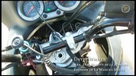
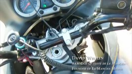
Can anyone help. See pics, bad and good.jpg. Good shows how the text looks on blu ray and digitial render. Bad is how it looks when I render to DVD. My project was edited on 1280x720 29.97 timeline in Premiere Pro. And all the text plates are the same 720 p. I tried a bunch of stuff: I tried changing text boxes to DV quality and I get same result. I tried interpreting footage as 1.2 DV widescreen. Still bad. Nothing works. Do I just have to live with this. How do the big movies make it look good? Do I have to use bottom third color scheme. I think this would do it, to use opacity on bottom third. Sorry even this website shows the good aliasing too a little.