I recently saw a few films by the director Mike Hodges, namely Croupier and I'll Sleep When I'm Dead. I noticed that these films really don't look highly "corrected" and instead have a very "naturalistic" look. If you compare these films to say, the work of David Fincher ala Fight Club, Hodges' films seem like they don't undergo a very lengthy correction process in post at all in the comparison. Can any of you experienced guys who've seen work by both directors comment your thoughts on this? Are films such a Croupier also corrected, yet *meant* to go for a "natural" look, or are Fincher's works just far more "processed" in post, to give them that specific look. To me, Fincher's work comes off as more cinematic as a result of this extra processing, if it is indeed present.

Navigation
Install the app
How to install the app on iOS
Follow along with the video below to see how to install our site as a web app on your home screen.
Note: This feature may not be available in some browsers.
More options
You are using an out of date browser. It may not display this or other websites correctly.
You should upgrade or use an alternative browser.
You should upgrade or use an alternative browser.
"Naturalistic look" vs. "Corrected Look"
- Thread starter prodigal
- Start date

gonzo_entertainment
Veteran
It's the look they want. Every film on that level goes through multiple stages of correction by a guy making a couple hundred bucks an hour.
Figured that's probably true. But then does the difference in looks have to do more with things done in post-production or just the way the film's have been shot? I know this is almost a firsthand question and thus can't expect a great answer but just from visually looking at the films, what do you guys think?
For example:

vs.
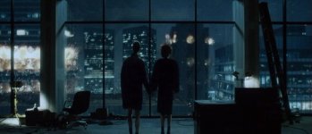
For example:
vs.

Ewan L
Active member
Figured that's probably true. But then does the difference in looks have to do more with things done in post-production or just the way the film's have been shot? I know this is almost a firsthand question and thus can't expect a great answer but just from visually looking at the films, what do you guys think?
For example:
View attachment 48557
vs.
View attachment 48558
Huge difference right there. It all also depends on what type of film it is. Sometimes I think it's essential for it to undergo some correction if it's horror etc...
j1clark@ucsd.edu
Veteran
Figured that's probably true. But then does the difference in looks have to do more with things done in post-production or just the way the film's have been shot? I know this is almost a firsthand question and thus can't expect a great answer but just from visually looking at the films, what do you guys think?
For example:
View attachment 48557
vs.
View attachment 48558
I think both of those examples have been 'corrected' to the visual the director desired. While the first, seemingly 'natural', may not have the dramatic lighting of the second... I'll bet some form of color work was done to get from perhaps a 'technicolor' bright/saturated look, to a less 'obvious' technicolor look.
Whether one or the other 'takes more time', etc. could only be asked if one knew the original image, and whether it was a 'one-button' correction, or what...
While not exactly a apples-apples comparison, when one sees the BTS shots of 'the set', and then in the back of one's mind compares the resulting post-process screen result, there is always some to more amount of color work done, even for romcoms which typically have pretty bright overall images, and rather 'naturalistic' color renditions.
It's lighting, film stock, color correction, art direction and frame choices. The look comes from everything combined and has to be decided on from the beginning so everything can coordinate. Changes can of course be made in post, but the basic concept of the look comes from everything.