Movie Poster - "The Hunter"

We are about to enter two short films into some festivals, as well as release them on DVD.

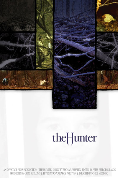
Here is the poster for the second film, "The Hunter", it is a dark thriller.
hunterposterweb.jpg


I would love to know what you think of it.

Thanks a lot,

Chris
 
It's better than most of the stuff in the current imdb competition.Personally, I want to see more than just branches and tiny people... but maybe that's the point (leave me wanting to see more). To nitpick, the images seem too crisp... like video. If I were playing with it in photoshop I'd be tempted to test some more extreme gradients on a few of the images or tinker with lighting effects. I'd also love to see what it looks like with a more uniform color scheme... say, all shades or brown/yellow/rust or shades of gray/blue/purple etc...
 
i think it looks great, but it doesnt look too much like a movie poster to me- at least one with your genre. very nice though
 
I like the concept. I'd work on the subtext at the bottom though, that alone will give it a legitimate one sheet look to the common person who may look at this.
 
kai said:
I like the concept. I'd work on the subtext at the bottom though, that alone will give it a legitimate one sheet look to the common person who may look at this.
Something like...
"Hunting Season Is Officially Open."
 
Thanks for the great feedback so far.

One specific question, is the picture of the little girl's face at the bottom too subtle?

Chris
 
CMessineo said:
Thanks for the great feedback so far.

One specific question, is the picture of the little girl's face at the bottom too subtle?

Chris

I didn't see it until you said something, which is pretty cool.
 
CallaghanFilms said:
Something like...
"Hunting Season Is Officially Open."

I was referring more to the credits at the bottom. Look on commercial dvd's to get a feel for all the information that is typically listed down there, and fill yours in accordingly. That will give it a "legitimate" look.

...and yes, I'd put something like a tagline (hunting season is officially open, etc) kerned out wide right underneath the title in a small serif font
 
Hard to say regarding subtlety of the girl's face until you see it in print... I could see the outline of the box, but didn't pick up on the face until you pointed it out.
 
CMessineo said:
Thanks for the great feedback so far.

One specific question, is the picture of the little girl's face at the bottom too subtle?

Chris

Maybe, but only just a little. I thought there was something there, maybe a gradient, but I couldn't tell. I did notice that there was a definate breakup off all that white space, which is a good thing.

But once you mentioned it, it popped right out.

A litle more text might be nice.

The font for the title is great, and the photoshopped top section is good too. If I didn't know anything about the film I would still get the impression of a dark/creepy/scary/thriller genre.
 
Rapier_100a said:
I did notice that there was a definate breakup off all that white space, which is a good thing.

Not always true, negative space is a very powerful thing and draws the eye to the title
 
kai said:
Not always true, negative space is a very powerful thing and draws the eye to the title


Yes yes, I know. :beer:

But I think the poster was improved by having that particular space broken up.
 
I Think You Have Too Much Information In The Poster. Not My Style. But If You Try To Use Less Pics. Too Clean. Try Something More Abstract, Gory Colors....
(i Actually Do Posters For Production Companies)

Good Luck
G.
 
abalex said:
I Think You Have Too Much Information In The Poster. Not My Style. But If You Try To Use Less Pics. Too Clean. Try Something More Abstract, Gory Colors....
(i Actually Do Posters For Production Companies)

Good Luck
G.
That is a very interesting point about the collage of images in the poster. One of the reasons we did that was to reflect the film, which often puts 2 or 3 separate images on the screen at the same time. Also, we were hoping the white space would help balance out the frenzy of the top half.

Do you have some samples of your work? I would love to see them.

Chris
 
Back
Top