PegLeg Media
Well-known member
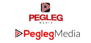
Me and a friend are working on a new website for our freelance work and right now we are trying to create a new logo. Im just looking for opinions on these 2 and ideas for something new. let me know which you like better or if you think we need to start over. thanks!