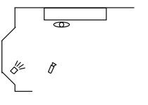
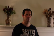
I was really inspired by Azmyth's thread on lighting cinematic, and really appreciated the insight from Perrone and others on that thread. With a shoot coming up this weekend, a new camera and light kit, and not enough experience putting together lighting setups, I figured it would be worthwhile to do some tests. Knowing how helpful the other thread was to me, I thought I would put what I did up in case it will help someone else.
Let's start at the beginning. Straight on keylight, just run through a diffusion gel. Ouch.
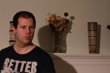
What happens when we add some umbrella fill?
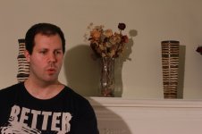
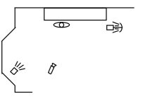
And add a couple of background lights.
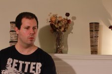
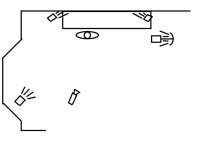
Hmm. While definitely better than the first shot, there are still big problems. Mainly, the face is too bright still and the shadows are downright nasty. Next step was to soften the keylight by bouncing it out of the upper corner of the room (still through the diffusion gel).
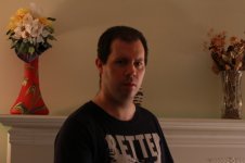
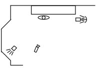
Ah ha! Much closer to what I was looking for. Lets throw in the background lights again.
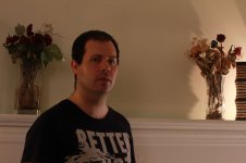
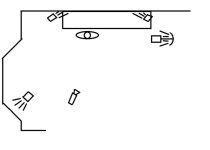
Getting closer still. Turn the BG light on the right to get rid of those highlights, and shifting the fill light gives us.
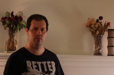
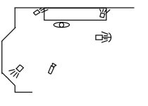
Now we are almost there. This is where I stopped adjusting the lights and started testing some of the camera settings. The only one I'll put up here was upping the contrast.
Let's start at the beginning. Straight on keylight, just run through a diffusion gel. Ouch.
What happens when we add some umbrella fill?
And add a couple of background lights.
Hmm. While definitely better than the first shot, there are still big problems. Mainly, the face is too bright still and the shadows are downright nasty. Next step was to soften the keylight by bouncing it out of the upper corner of the room (still through the diffusion gel).
Ah ha! Much closer to what I was looking for. Lets throw in the background lights again.
Getting closer still. Turn the BG light on the right to get rid of those highlights, and shifting the fill light gives us.
Now we are almost there. This is where I stopped adjusting the lights and started testing some of the camera settings. The only one I'll put up here was upping the contrast.