Just shot a mall commercial.. screenshots (What do you think?)

DDirector

Veteran
I just recently finished shooting a mall commercial this weekend.
Here are some screenshots straight from the camera... okay, maybe with a little tweak here and there in Redcine-X.

I just want to hear some insight on any pros/cons of what you see. So I learn for next time.

I worked as the director of photography with a camera operator.
Shot on the Red One-MX with Zeiss Ultraspeeds

*Went in with horrible expectations. Had issues with director not knowing what he was doing nor what the shots were.
Most of the pre-production was done the day before and a lot of it was figuring it out on set the day of.
But, in the end looking at the screenshots and seeing the raw footage, I think I am very happy with the results.
A024_C033_0302DV.0000419F.jpg


A028_C012_0303UU.jpg


A028_C032_0303BF.jpg
 
Last edited:
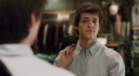
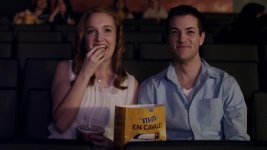
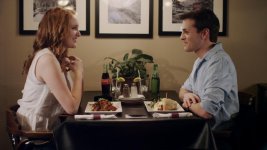
My first thought viewing these three grabs is that these aren't really lit in the traditional "commercial" style. This looks more like indie-drama lighting overall. Just curious was this for a real client or for practice? And did you guys get clearance to use the M&M, Coca-Cola, and Sprite logos?

Grab 1:
- I feel this is the best one of the bunch.
- Instead of the 3/4's backlight you have, I personally would of gone with a frame of silk with a big ol' source going through it from camera left. It would give him a nice catch light too.

Grab 2:
- There is no backlight from the projection booth hitting them on the back of the head. Kills the whole illusion.
- The main light looks like it's coming from camera right by the shadows on their faces and the shadow of the popcorn.
- No eye light.

Grab 3:
- This is more of a location issue then cinematography but why wasn't this shot in the food court if it's a mall commercial?
- If this is showing off a restaurant inside the mall, you should of got them off sitting next to the wall. There isn't any depth to this scene.
- My eyes are drawn to the pictures on the wall since it's the brightest part of the frame.
- To profiley, instead of having them seat 180 from each other try siting them 90 from each other.

For the next commercial you do, I recommend watching a ton of commercials on Vimeo and Youtube and really deconstruct the lighting setups.

How'd you like those Ultraspeeds? :) Post the finished commercial when you're done!
 
- Yes, it was for a real client
- Yes, we did get permission to use that stuff in the commercial, that's why they wanted to show it off.
- The director and the client wanted to go the non-transitional way of doing commercials and make it more of a 'movie like' feeling from framing and lighting.

- Working with 3 mirrors pointing in all directions is hard. It may not be seen in the shot, but Ive never been in such a situation. But i do see the eye light thing. Cant believe i didnt notice it.
- Ah, the back light of the projector. In the shot it was high up. We did do a jib down from the projector to give it flares but it was pretty high up, but youre right. I should have given them a back light.
- No eye-light?

- Food court was really bland. Bad location. They really wanted to shoot in the restaurant but due to it having to shoot during hours, the access they gave us was only in one corner of the restaurant. I really wanted to shoot in the opposite direction to give it depth, but because of the limited space, it was a forced decision. I know :(

- This commercial had its own little theme. The couple buy clothing for themselves and a gift for each other. In the end you realize its somewhat of like a date in the restaurant and they also catch a movie.
 
If you've got some control .. in 2, to assist the movie theatre look, lay in some fake movie dialogue.

In 3 to help give it a 'mall' look, run some 'reverberant' mall restaurant sounds in post, even if you have to go record some.

Carefully mix to taste.

Cheers.
 
If you've got some control .. in 2, to assist the movie theatre look, lay in some fake movie dialogue.

In 3 to help give it a 'mall' look, run some 'reverberant' mall restaurant sounds in post, even if you have to go record some.

Carefully mix to taste.

Cheers.
I believe this will be an all audio (music) type commercial from what I have seen from the rough edit and temp music
 
Next time just do a big bounce source for your movie screen. It looks like a pretty directional light is hitting them, which isn't quite the quality of light that would happen when the projector bounces off the screen. That will also solve your eyelight problem. Also, a lot of times I see people will haze up their movie theatre, so they can see the changes in the shafts of light from the projector.

I like the first grab a lot. Pretty nice.

You already know about the third. :/ Bummer, but it happens!
 
Well shooting commercials is always a learning experience, and sometimes the best laid plans don't work out. Yesterday I had 7 hours of travel to an auto dealership, got there and the temperature had dropped and the wind picked up. 10 feet of PVC dolly track shattered due to temp, a sandbagged camera blew over, and we couldn't use any overheads because of safety issues. Bottom line... As long as your clients are happy, you did a god job.
 
Actually I did have a big bounce right in front of the screen.
I placed the actors in the second row and I shined a light into a large bounce with multiple colours changing to simulate the movie screen. I do see an eye light, that's the thing.
There was also a second smaller light to act as the ambient light as at times it got pitch black so I used that light, but it does look like its a bit sideways.
 
Well shooting commercials is always a learning experience, and sometimes the best laid plans don't work out. Yesterday I had 7 hours of travel to an auto dealership, got there and the temperature had dropped and the wind picked up. 10 feet of PVC dolly track shattered due to temp, a sandbagged camera blew over, and we couldn't use any overheads because of safety issues. Bottom line... As long as your clients are happy, you did a god job.

AH MAN, sorry to hear that David, hope you didn't have serious damage. I hate days where you work so hard to leave a shoot feeling defeated, hope this wasn't the case, and you were able to salvage the day with good coverage.
 
I think it looks pretty good for being untouched, The good thing, you shot Red, so you can always get a bit more leway in post. I think the movie shot, is a bit bright, I would try dropping the overall exposure, I think you could sale the shot with a projector sound and some "Film plug-ins" Maybe try making the shot look as it was shot on film, I think some flicker could help to enhance it as well. If it doesn't work, then hey, no harm in trying different things.
 
AH MAN, sorry to hear that David, hope you didn't have serious damage. I hate days where you work so hard to leave a shoot feeling defeated, hope this wasn't the case, and you were able to salvage the day with good coverage.

The camera in question still works fine.

Thank God for the Warp Stabilizer, that's the only thing saving our butt, it was that windy!
 
Actually I did have a big bounce right in front of the screen.
I placed the actors in the second row and I shined a light into a large bounce with multiple colours changing to simulate the movie screen. I do see an eye light, that's the thing.

Hey Michael, I retract that comment. I am on my laptop and the angle of my screen took out that light. Since I didn't know you guys were going for more of a cinema look I understand why is doesn't have the traditional commercial look. But still, post the finished video when it's done. I'd love to see it.
 
Grab 1: My favorite of the three. Nothing really to say, except maybe a hair light would have been nice since it's a commercial.

Grab 2: I think it would have been nice if there was a bit more dropoff behind the talent, to make it feel more intimate. And once again a hairlight to make them pop a little would be nice.

Grab 3: The reflections in the pictures bothers me, maybe would have been better to move the table out from the wall, give it more space and some nice DOF. Also I really wish there was something better than that plant on the table, but I know that wasn't your call

Overall though, I think you got some good stuff. Be sure to post up the finished product when it's done, i'll be interested to see how it gets colored.
 
The thing I admire about you Michael is that you really put your self out there and you give stuff a go and you have a passion to learn stuff.

Sometimes I do think you get distracted by things out side the scope of a D.P but you will learn that over time as well. (experience)

Posting up shots takes guts..so well done.

One and two ..pretty good effort .

Do try and avoid things throwing shadows on talent as in 2 though. (then others have said..plus add a little mood to the shot maybe)

Grab 3. I know you may have had location / set issues but that s part of the game that you need to solve ( as well as possible). A D.P is a solution providor and problem solver just as much as being creative with light and lens. ( Its 90% of the shoot)

I will suggest how basically I would have lit #3 simply and fast ...just FYI .

Turned off or screened of all location light first. Blacks on stands.

Moved the table out from wall as far as possible.

Set a soft light eg . Kino / Chimera... boxed up on the background shoulder of each of the actors just out of frame. 3/4 back cross lighting them. ie Each light acts as both a key light for the opposing actors as well as a back, rim light on the other actor. Bring the light for the female slightly more frontal ( flatter) and the male less so. Chicks like to look pretty (more frontal filled)and shadow less ( aging and ugly)

Set a soft bounce off the ceiling or white over head panel to top fill the scene ( ambience) and eliminate refelections in the pictures on the wall and the shadoes on the wall.

Then I would have dropped an overhead soft box ( out on an arm) pointing down onto the table area to bring some detail into what is very flat.

Set cutters to give the scene some shadow , focus and control of spill.


Professional advice: FWIW
Dont criticise the Director, production, art department, makeup artist...whoever etc..in a public forum. ( especially if you imply your work is better that theirs and they are the issue why it doesnt look that way). ie Dont make excuses. You are part of a collaboration

Be careful that you have the right to post images up. ( eg Talent, Production, Client...) before its aired. (even then ...ask first)
 
Shooter has really good points here. I'll comment on the third setup. Even for an actual film, I hate having setups up against a wall. It will always feel like a cheap set. Separation from the wall would really help and to actually place them closer to the middle of the space with background talent would really liven up the scene. Also, when doing the location walk thorugh before the shoot, take notes about all the existing lights and even the artwork. I have run into situations where I luckily brought non-relfective artwork because I knew it would cause problems. Sometimes you can get lucky and swap artwork that's already in the space. Good luck man... all this will become second nature as time goes. The only way to learn is just do it!!!!!
 
Thanks for the tips.
I know the restaurant one would look weird being up against the wall. I personally didn't like it, but i did try the best I could.
I thought that pulling it out from the wall would look weird as i couldn't pull it up too much as there wasn't enough space, but I could have still tried. Sometimes im in such a rush and doing it with minimal pre-production that i skip some steps.
I definitely should have given it a try, but i just ignored it assuming it would look bad from the start.

I haven't shot commercials before. This was my first real commercial I did.
I am pleased with the results, but I know I could have done better, especially with your advise given for future reference.
But, I am curious, luckily they wanted a more cinematic look in this commercial, but how does lighting differ from normal commercials?
I did watch several of them, but maybe Im not seeing the picture of how it was lit. Whats the difference?
 
I find that the general "commercial aesthetic" is well lit, clean, and shinier than the "cinematic" look. Reduced shadows, regular use of a hairlight to make the talent pop out,
 
Back
Top