Interview Reel: rip it up

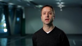
It seems you never set up an accent light to highlight a detail in the background.
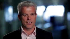
It also seems you barely ever take advantage of "wrong" white balance - letting things go blue while keeping the subject properly white balance.
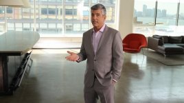
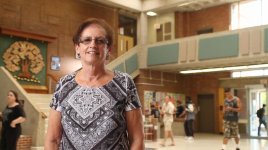
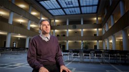
Moreover some framing is not taking into consideration that objects in the frame end up acting like shapes - for instance you have a predominant couch in one frame overwhelming the frame. Basically you have to remember that you have 2 kinds of environments: one that adds to our understanding of the person - say the woman with the piano in the back and two the one that simply is a space so you just have to go after an attractive frame.
 
Thanks so much Patryk

I definitely need to spend more time getting backgrounds right, especially in terms of lighting them. Many of those samples actually have some background accent lighting attempt... just waaaaay too subtle once I get to the edit bay. Thanks for confirming my suspicions.
Oddly I use daylight + tungsten mix with some frequency; the Chertoff interview for instance (semi-skeletal guy w/ 2 angles) walls were actually beige but bluish looked better, so lit it for that. In a few of the scientist samples I let a blue slash leak from the blinds be their own visual elements. Again, probably all too subtle? I'll have to research some extant samples.

I reckon I'll toss those interviews with the couch in the background on the revision... not my favorites anyway, they were just part of the same piece and the teenage kid is semi-famous now. Kind of like the Rumsfeld bit... space and background were total blah, but he looked good for the intent of the piece and he's a biggish name.
 
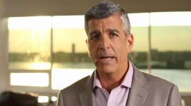
You have a tendency on almost every shot to shoot from about chest level up towards eye level. Really jarring and, particularly in the close-ups, annoying as an audience member who just wants to watch the person talk, not see some dramatic shot. Think of the "default" as being exactly eye level, and if you switch from default, you should have a reason.

You also set up a little too far off to the side sometimes-- do your best to keep both eyes in frame as much as possible without having the subject looking right into the camera.

These are general tips, every shoot can and will be different, but you seem to do the above almost every time, like it's a rule you've set for yourself.

And I agree, some background lights would really bring a lot of that background up from the mud it is now, or break up the boring walls when you don't have a lot of objects to put in the background.
 
Great thread BTW. Thanks McBob for letting the rest of us learn from the critique process. I know I have learned a few things that I do in interviews and how I might approach them different from this thread. The biggest for me is mixing light colours to good effect although for too many interviews I've ended up in beige rooms with people who have beige skin tones and with very little set up time.

I would love to hear anyones tips for adding colour to generic backgrounds.
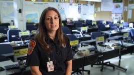
 
I would love to hear anyones tips for adding colour to generic backgrounds.
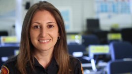
You use a small HMI; or daylight balnced LED; or natural outside windows to give illumination to the BG while keeping the camera tungsten balanced and lighting the subject with tungsten lights.

Like in this spot (sand very extreme contrast on the face that was used to give the talker the "edge" of the car styling):
http://tupeloproductions.com/c_cadillac4.html

Here are some other examples that use a.) pools of light to spice up the BG and sometimes b.) going into blue to differentiate the BG from subject:

(here BG is "overexposed" with 3 HMIs to give some edge to the chairs):
MVI_9548_2014-09-30_18-42-18.jpg

(because of the chair edge lights we get more interesting patterns when we go tighter):
MVI_9550_2014-09-30_18-43-36.jpg

(here small HMI provides a pool of light on the left and some ND not fully covering the window on the right lets pools of "overexposed" light coming in making making the frame more interesting; notice that the reflection of 12x12 diffusion reflected in the window adds to the overall attractiveness of the frame):
MVI_9462_2014-09-30_18-47-51.jpg

MVI_9478_2014-09-30_18-49-35.jpg

(even in this boring frame some attempt was made to add a pool of light behind the subject; notice how the camera is daylight balanced not to fight a tremendous amount of daylight ambient light poring in from behind and front of the subject):
MVI_9502_2014-09-30_18-45-25.jpg
 
Last edited:
Thanks again... I liked the impromptu set production with the partial strategic window ND. Have to admit I barely see what the HMI is doing in the wider shot immediately preceding it... is it that hot spot below the windows?

certainly HMI or LED could be helpful, might have to settle with some gelled(or not) V-lights until my light budgets and setup times increase. If I do get time to light a background, it's usually with a simple pro-light... perhaps my mind is still in news/small-sensor shooter land where I'd tend to separate backgrounds by lighting them 2-4 stops darker in general.

I think I had a micro-fad with the profile-CU 2nd angle... a client asked me to do it once, they raved so much (even though it didn't look that great IMO - the football piece) that I just started doing it more... more clients liked it, and so on. It perpetuated. I wavered on whether to include white/black void shoots in this, because it's a look I really don't like but can do when asked... like doing stock video: do you offer what you like, or what sells?

Personally I like setting the camera a bit above or below eye level and probably won't stop. It's just more interesting to me, same as the closeups in general... but yes, you all have a point - I could certainly use some more variance in the reel.
 
Mixing daylight and tungsten is a technique I use a lot. In fact mixing colour temperature in general is something I do all the time, even if it's just a back light. Just white balance to the key-light and you're good to go.

LMAX1.jpgLMAX3.jpgSat1.jpg
 
Some of the shots could have been improved with more rim-light on the subject (a couple of the clips had it done well).
It seemed as if the lighting was often too harsh. The womens' faces looked very sweaty and lit in a way that was quite unflattering. Again, this was done very nicely in some of the shots, but others could have been improved with softer lighting. This is also the case with some of the shots of men. While harsh lighting can have a masculine effect, it was distracting in several of the clips.

Sound quality, particularly the background noise, shifted throughout the reel, especially between clips from the same project. I'm not sure if you did the sound yourself, but if so, it could use some improvement.


These were my observations, but you could disagree with them and have good reasons in doing so. I am in no way a pro.
 
I dont see too much I dont like with any of the interviews ...although I am not too big a fan of "too far off camera eyelines" (they may work in edit context so I wont comment on them)

I think some are absolutely fine as is and some could be "improved" with a little judicious post work. " ie power window grades ( vignettes or light masks - what I call "post lighting")

Separation from the BG is what I strive for by composition, distance, lighting, DOF and art direction.

Mixed color temp and fruit salad lighting is a 'trend look " thing that comes and goes. I feel its often a "news style look" more than a natural doco look.
 
Back
Top