Frame Grab Critiques

Rain Man

Active member
Hey I'm working on a project over the next week or so with lots of interviews of people. Just wanted to get a little feedback on these, trying to get better...

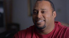
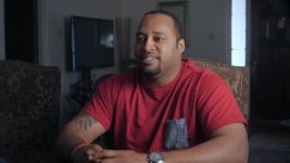
The Mid shot was a C100 with a 24-70 at about 35mm and the close up was a 60D with an 85mm. Time and space was tight, so the only light source was 2 1K Fresnels bounced off the white side of a 60" 5 in 1 reflector.

Once the editor started working on it, my first thought was that I should have moved the light source a little further away from him, or tried to squeeze in a little fill light from the other side.

I appreciate any input, not just about the lighting!
Fl-Mid00.jpgFl-Close00.jpg
 
Last edited:
I don't know if it needs any fill. And I really don't know, I'm not saying I don't think it does. It depends on what type of project this is. But viewing it completely out of context, the contrast doesn't make it difficult to look at. Maybe the light could have been warmed up a bit too. I think it would probably look nicer but again, I don't know what you're going for.

What I would have done is moved the key to the other side so it's lighting his face, not the side of his head, or at least lighting the side of his head that we don't see. The window in back could also motivate a subtle rim light as well, but that's not as important as getting the key right.
 
I tend to try and light and interview depending on the subject matter. If the content is dark or moody I light that way and if its just gloss and glamour then I light with soft lights that wrap more and have less contrast in the shot.

Without knowing the subject matter its hard to say. I agree with David W Jones that the background could use some carefully placed accent lighting to light it up a bit. Also depending on the space I might have tried to set up the background different but again I don't know what you have had to work with. I've had to shoot interviews in small kids bedrooms before and you end up just doing what you can given the space so take my critic with huge grains of salt.
 
You need to key from the other side, 99 percent if the time you key from the side of the face that is away from camera, helps people look more 3d. Of course there are exceptions but this is not one. Also a little rim/back light and a little piece of light in the background will make it look better
 
In addition to what's been said:

Get the extra chair out of there.

Try to find a chair with a lower back.

Rotate around the subject to get that black doorway and TV out of the frame. His head is blocking the nicest part of the background.

Get your interviewer closer to the camera so his eye-line is less extremely off frame.
 
I was going to reply to each response individually, but a lot if it pretty similar. Thank you guys for the responses! Good stuff.

The key light was a mistake. Should've put that on the other side of him! Bush league.
 
In addition to what's been said:

Get the extra chair out of there.

Try to find a chair with a lower back.

Rotate around the subject to get that black doorway and TV out of the frame. His head is blocking the nicest part of the background.

Get your interviewer closer to the camera so his eye-line is less extremely off frame.

Definitely was sloppy with the extra chair and having that black door in the frame. Also, I didn't realize me being so far away from the camera was an issue, but this is good to know!

Seriously, thank you all for the input. And I'll likely be posting more over the next couple of weeks.
 
Last edited:
Looking at this again, I feel like my framing on the mid shot is a little off. He's too close to the center.

What do you guys think? Should he be a little more to the right?
 
Back
Top