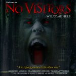
Feedback needed on DVD artwork for Amazon.

Editorialz

New member
Hi Guys,

I really don't know what I would do without some of the knowledge gained on this forum and I mean it when I say I am so thankful to so many of you on here.
I don't post as a rule because most of my questions are already answered by some generous contributor or other but this one is a direct appeal for feedback on some artwork.
Novisitorssm.jpg
thanks,

Edward
 
It's pretty good - It would look cooler if the teeth were different though - not sure if that's the actual character in the film, but sharp fang teeth or even no teeth - basically, the teeth look friendly and not scary
 
IMO, the text is too crisp. It stands out, separate from the poster, and makes it look "Photoshoppy." You could try a blur, or an adjustment layer over the whole thing, something to tie the text in to the overall image better.
 
It's pretty good - It would look cooler if the teeth were different though - not sure if that's the actual character in the film, but sharp fang teeth or even no teeth - basically, the teeth look friendly and not scary

Yeah, some decay on the teeth would make a big difference.
 
IMO, the text is too crisp. It stands out, separate from the poster, and makes it look "Photoshoppy." You could try a blur, or an adjustment layer over the whole thing, something to tie the text in to the overall image better.

Right.

Also "A terrifying journey to the other side" sounds a bit blah. It's in quotations -- is this a quote from a review?
 
"A film by edward white" looks like you skipped elementary school. Either make the "A" lowercase, capitalize the first letters of each word, or capitalize everything.
 
Back
Top