DVD case sleeve (printing)

You've put in a lot of effort. It's looking good.

I will murder you!


hahahah j/k but come on don't say it looks good when I am on my knees beggin for feedback, you are killing me, lol!!!!

Seriously though, p[lease tell me what title to go with! pls!!!
 
The latest... look at their shadows... something weird and "off"

1195090830.jpg
 
Last edited:
Here is the title... I have gotten some re-enforcement from others.... (not you cause you bastards don't want to help me! :) )

So I decided this will be the title.... here is a closer look at the shadows and the title... the black part of the letters is still a font which is at 80% opacity... I am guessing it will be a lot more contrasty on the print so I will do the proof at 80% and might have to make it a bit darker

1195089696.jpg
 
I finished re-working the DVD sticker... I am not printing the actual CDs cause that's gonna be $3.75 each... I is a broke-ass... :)

So instead I am printing the same labels but I made everything fit and added my company's logo

1195204286.jpg


or with the added picture pushed into the reds to match

1195204692.jpg
 
Last edited:
The cover is coming. The back is OK. The "WIDESCREEN" on the cover is an ugly tacky font, though. Makes it look like a cheap made for a dollar DVD release. Try changing it to Futura or a nicer sans serif font. The title "ransom note" letters are nice. I would make them solid black with the insides white though. The "blur" filter stuff you put on top of it makes it look tacky. Doesn't need it. Simple is better. Just because you have 87 000 filters doesn't mean you have to use them. I think the cover has potential. Just resist the urge to use filters because they're there. Often times exercising restraint is what makes your film stand out on the shelf.

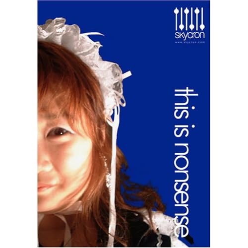
Here's what we did for our comedy DVD:
51jL8Ys8X7L._SS500_.jpg


Not saying we're the best by any means but it does stick out at you, notably because of its simplicity. Bold, simple design grabs customers. Because everything on the shelf is cluttered. As I say, your cover is coming along nicely.

The disc face cover in my opinion however needs a total redo. It looks cluttered and amateurish. Why not a simple black face with the title in white, with the same ransom text -- only white? It not only looks classier but will save you money in the disc printing process.

Just my $0.02. Hope it helps.
 
Thanks for your response but we are not competing for attention on the shelves... it is a short. Because of that I tried making it as preety as I could with what I had.

BTW, I allready printed them...


I wish I could re-shoot the picture of Jenna and Chris. I agree about the widescreen font not being the preetiest thing but I wish you would have mentioned that before I printed them. I was going for a color that would not stand out too much and ruin the flow of the photo keeping it organic, but that musky green isn't the most appealing color to everyone. I did however make it significantly smaller just before printing!

It sounds like you don't like my case at all, but I wonder if it is only a matter of taste. By looking at your cover it seems we have very different tase. Personally I would have worked the curves on you picture quite a bit... I dunno what it is about it but it doesn't work for me. Is it a bit on the pink side? Also the last two letters get a bit lost on the picture without a stronger shadow or other AA method. Then again I probably just don't like the look in that guys face because it seems to be asking for acceptance about the fact that he likes to dress like a little baby girl instead of some other look that might make it a bit more obvious that it is a comedy. But I am sure there are tons of people who will like the cover.

I am sorry my style seemed cluttered and amateurish to you. I was trying to emulate what I see in big budget movie cases with what I have both material-wise and knowledge-wise. There are many blockbusters that employ the simpler style with strong saturated backrounds and borders for the various sections and id done well those can be spectacular, but I opted to shoot for a more organic look.

I don't know what it is that you don't like about the DVD surface and I would love to hear that. BTW it is all supposed to look red... I am hoping that it will have a coog impact by contrasting with the "preetier" and more "normal" cover so just before popping it in it hopefully gives you the feeling that there is something wrong... not sure it it will accomplish it at all but I gave it my best.

This one is done tough... I already put in too much effort on it and it is just a short. My first fully independent project however so I wanted to do something good... anywhhay... on to the next project for me. But please do tell me what you didn't like about the DVD surfac3.
 
It's not a matter of taste. I can understand that you may not agree with some of what I am saying. Though having access to a design team, and as former graphic designer of various ad campaigns myself (albeit many moons ago) prior to starting a production company, I felt I could offer some insight.

I really like the back of your DVD cover. I think that's good enough to be a Hollywood release. Take a good look at it. The spacing of the blocks of text are in a large part why it looks pro. The only issues I have with the front of your DVD cover is the "Widescreen" font, and the texturing on the title (solid black with solid white is classier and easier to read).

The issue I have with your DVD face isn't the colour. It's the amount of images on the cover (too many) and they are all of an equal size. All the images compete for the viewers attention. Try having one BIG image and a smaller one to frame the text. Even just changing the sizes of some of the images would help a lot. The text should be in the very middle of the disc, not the side. It should be bolder and it says too much. It should only have the name of the studio at the top, and the name of the move at the bottom (or swap). They should be nice bold letters and big.

I sensed that some of what I said might have cut a little deeper than I intended it to, so I would like to clarify what I meant, as it may well have been a bit sharp.

We are lucky enough at Skycron to have an experienced, classically-trained design team in-house, and since most production companies don't generally have an in-house design team (the only reason we have one being we do a lot of advertising and branding), I had some time and tossed your cover to them to see what they thought. It was pretty much the same stuff I thought.

It really comes down to this:

It isn't so much the individual kinks I take issue with as much as the basics of design were a little lacking. Without that basis, any individual corrections I might suggest wouldn't have any context. Basically, design is a different beast than production. The aesthetic is different.

What makes a cover professional or unprofessional isn't a matter of aesthetics, it's basic textbook design. There is a technical vernacular for graphic design just as there is in film. Just as you can tell a new filmmaker by certain telltale signs (compositional problems, breaking the rule of thirds, etc.), you can tell a new designer similarly by the rules they've broken (kerning issues, negative/positive space, silhouette, kerning, gestalt etc). This comes from training and experience. It's the whole learning the rules before you break them thing.

Basically, I saw some of these things habits in your cover, kerning and that sort of thing. It's not major stuff ... but it was enough that it tipped me off. It's nothing to be alarmed about. They are common mistakes, made by people who are still developing their eye. I know I sure did. Everybody on my design team did! We all were new at this once... That's really the most fundamental. You develop an eye over time.

It's not a bad cover. I think you have a good natural eye. I would say it's about 70% of the way there. The other 30% comes with just making more designs, as your eye develops and you improve.
 
Last edited:
hummm... I see

The problem is that it is was starkly evident that you didn't read the whole thread and skipped right to the end. Then instead of only trying to point out useful tips to a guy begging for last minute help, you instead said just a little something and added your unwarranted opinion... I was asking specific questions and had been for at least the last page which you also didn't read. Let me summarize: I am taking baby steps.

Telling me that the project is amateurish and the lettering is tacky is both unnecessary and completely useless to me. Instead you could have told me what you thought could make it better, and why doing that would give the project a better chance at being accepted by a wider public. Teaching me.

It wouldn't have been hard for you to write a more helpful post while keeping it more proper and professional. Yes, the noob said professional. :)

There is obviously a lot that could be pointed out to me which could have a big positive impact. There are PILES o' stuff I either don't see or just don't get. For example I completely forgot about the rule of thirds when I was creating this. That is something I didn't "see" I was forgetting.... or didn't "get" as something important which you should never forget. That happened due to how overwhelmed I was by trying to figure out PS. BTW, most of this thread was about how to do things right in PS in the first pages.

I AM being defensive. Yes. I admit it, and I have no reason to hide it. I too am a blunt person and I can take reality for what it is. Also, since we started our little independent company I have not created anything other than "A Walk in the Dark". I am fully aware that this makes me put way too much on it's back, and it is something that you can't avoid at this stage and need to remedie by moving on as fast as possible...

I have no problem taking constructive criticism. If fact I do remember openly begging for it in the nights before I went out to the printing house to spend the little money I don't have. Now, if someone asks for help and opinions, I believe that you should only respond if your opinions are going to help or if you want to post a few tips. Otherwise there must be some other purpose for posting which is neither helping or starting a useful conversation of some sort.

I didn't feel there was much I could harvest from your first post. Perhaps you should have mentioned the rule of thirds, or other useful pointers which I am sure you have arsenals full... From reading your post I didn't get much more about the DVD surface than that it seemed cluttered to you (useful!) and amateurish (useful? insulting?)... I agree that it is cluttered, I seem to be overcompensating for my lack of experience and by going both Baroque and OCD mixed together. Also, I had only three images in but switching to the thinner template for the stickers left a big empty area which I was quite frankly afraid to leave open! I laugh about it but I also can see myself doing it over and over again in the near future till I build a bit of confidence and finesse in my compositing... But what was I to get from the fact that you though it looked "amateurish"? I AM an amateur... that's the starting point, isn't it? So how was that supposed to help me? Or was it supposed to help you?

Again telling me that a simpler design for the title might be a way to go is an excellent tip! I thank you for that! It is certainly something that I am starting to wake up to realize that this project needed a bit of. In my current opinion this project could use a bit more more simplicity in at least the title and the DVD surface...

Again, saying that the letters for WIDESCREEN look "tacky" is too useless of a personal of an opinion for someone who didn't bother to read the whole thread to share... Maybe I am a bit defensive... oh, wait.... no... I AM defensive... remember? I know it :) But saying that you did not like them and you are convinced that they should be changed would have helped me just as much, without the unnecessary detail of your exact personal opinion which wouldn't help anyone other than... yourself..??? I am confused... so I am wondering who they could possibly help?

Forgive me for also getting too personal with you now, but it seems you are comfortable in that environment anyway... I guess you work in a rough cut-throat environment. The ad-man is a persona we all know all to well. I have no problem with that environment... in fact I thrive in it. I have an overwhelming tendency to being just as blunt as any boss or owner you ever worked for. I believe that sugar coating is a waste of time and resources. However, in this thread I was asking for help on how to make the project better... by the time you posted I had already gone to press twice more than I could afford (twice).

In the last hours or days left for an inexperienced PS user, such as myself, saying that the project is ::insert derogatory adjective of your preference here::

...well that simply isn't helpful, is it?
And hence it needs not be posted.

The same goes for me confessing that your cover looks like some sort of kinky DVD in the wrong section. I didn't initially say it because it wouldn't have helped you in any sort of way. I am sorry if my opinion doesn't sit nicely, even if you don't think a noob's opinion (I AM a noob) should be able to shake your faith and trust in a big and prolific company such as the one you eagerly described to me... but I thought people that speak like you did, and now also me (just in these two posts out of the few thousand in DVXuser), well that that's the type of people you liked to surround yourself with.

Luv your baby. Please don't respond, I am sure you have way bigger fish to fry.
 
Roberto,

Not to be overly critical but shouldn't the text on the spine read from top to bottom and not from bottom to top?

Most DVDs can be read on the spine side with the front cover facing up.

Otherwise, the work you are doing looks great.

EDIT: I apologize if I missed something about this somewhere in this thread :)
 
Last edited:
hey John... with your super polite posting there is no way I'd feel anything but happy to hear your critique, plus you make a cleat point :)

This was mentioned before in this thread, yes, but I decided to go against it... I am taking many liberties on this DVD since it is just a short film and I plan on making new ones for each project as well as making one for my reel

hey I just remembered though, lol... I gave a copy to one of our crew members and when he went to look at the spine he turned it the other way... it made me feel dumb, lol.... BTW my reasoning was that I wanted the text to be going up instead of down... is it a really standard thing though?
 
Last edited:
I think it is pretty much a standard to have the spine text read from top to bottom. If you check DVDs in the store or at Blocbuster you will find that most all DVDs are that way.

That being said, I don't think it is a rule that cannot be broken. It is probably done that way so that you can read the title from the side when the case is lying face up. Almost evrything including all video games and VHS and even books are labeled that way. You might consider changing it because if it would ever be put on a shelf with other DVDs to where only the back spine was showing, it would look out of place being the only one that was reversed.
 
Hi,

I did read the whole thread.

I took a good long read at your post, and went into a decent amount of detail. I still provided detail so that you may apply them for your next project.

That said, if I truly felt a class caste, I wouldn't be taking the time to respond. I gave you lots of detail, and you skimmed it, the same thing you just said I did.
 
Nope... you gave me equal amounts of info as the amount of unnecessary demeaning opinions. Which made me wonder if you were trying to help me or just trying to say that your company can do a better job than I...?
A post by someone in the know could easily have had tons more detail but it seems clear that helping me was not your only motivation. Let's drop it.

You might consider changing it because if it would ever be put on a shelf with other DVDs to where only the back spine was showing, it would look out of place being the only one that was reversed.

Yes... that's a thought in my mind that's bothering me a bit... and also... the english language is written from left to right and top to bottom! lol.... the more I think about it the more I think I messed up.... now it will take an other $40 for me to print a few copies and avoid having one spine upside down like you said... lol.... [homer] DOUH! [/homer]
 
Dude, don't ask for help if you can't accept a little criticism. Skycron's points are not only completely valid, but should be extremely helpful to you if you'd just take the time to give them some consideration...

The main problem with having the title read upwards is that if you lay it down flat on a table with the face up the text will be upside down. Up to you though, as you said it's just a short film, not a major release.
 
Dude, don't ask for help if you can't accept a little criticism. Skycron's points are not only completely valid, but should be extremely helpful to you if you'd just take the time to give them some consideration...

Skyron's "points" were laced with cynicism and were debasing, and bordered on the insulting. I seriously considered removing his posts outright.

What he brought to the table wasn’t constructive criticism, it was patronizing criticism.

I could take the time to pick apart what I see as flaws in the example he posted, but I’m not going to waste my time.

USLatin, good job so far, and one of my only crits would be the integration of the woman and guy into the other pic. There is a pretty noticable hard line around them which makes it look a little off, kinda makes them stand out as their own element. Also, the focus and color is just a tad off. Both are easy fixes though, a little feathering or Layer Masking and some very slight color adjusting and you're there. nice touch on her shoes, by the way.
 
Last edited:
Skyron's "points" were laced with cynicism and were debasing, and bordered on the insulting. I seriously considered removing his posts outright.

What he brought to the table wasn’t constructive criticism, it was patronizing criticism.

I could take the time to pick apart what I see as flaws in the example he posted, but I’m not going to waste my time.

USLatin, good job so far, and one of my only crits would be the integration of the woman and guy into the other pic. There is a pretty noticable hard line around them which makes it look a little off, kinda makes them stand out as their own element. Also, the focus and color is just a tad off. Both are easy fixes though, a little feathering or Layer Masking and some very slight color adjusting and you're there. nice touch on her shoes, by the way.

Matt bro I feel like a huge weight was lifted off my shoulders now that you said that... Not since I joined have I ever gotten upset with anyone, and I am one of those who is a bit trigger happy in terms of post quantity... I feel better now that I see it wasn't just me. What sucked was that I felt like I had added high school drama by pointing it out instead of just brushing off my shoulders... but like you I don't think that people should be allowed to patronize people asking for help. Just because there is a certain type of treatment at work, well it doesn't mean that it is ok, or that the industry is like that... this industry is as we make it, same goes to our forum. Allowing that sort of posting would discourage members from asking questions which in turn build the forum for many others to find info while searching. I feel part of this community since so many of you guys have helped me get the education I couldn't afford and continue to give a lending hand with patience and encouragement. Because of this I felt I needed to say something.

DeVi, I know what you mean bro... I was worried someone might think that's what was happening but I couldn't avoid it. Please trust me when I say that I WANT CRITICISM... I know that I need it... without it I would just sit here spinning endlessly in a spiral of second guessing... :)

I really hope this won't discourage people from commenting... if you guys didn't I wouldn't have noticed that when the DVD is laying flat the name on the spine will be upside down! :) Thanks for putting it that way!
Or that Matt noticed the difference between Michelle and the Groundskeeper to her left like I do when I see it! Thanks for mentioning that!
If people stop criticizing my work I will be toast... DVXuser will stop providing me with a connection to peers that I so desperately need... please continue!


About the difference between Michelle nd Matt... I notice it too and I think it might be mostly from the stark contrast between her highlighted arm. The light coming from different sources made it so that this feels unnatural because... well it is.. :) I think I should have tried cutting her arm and doing some fine tunning on... I could have messed with curves to tone down the high end. Then I do agree that there seems to be a little color difference between the two photos... but maybe to make it a gradual transition I could do her arm then her and then both her and me (to the right)... hummm... it really sucks that i am done printing them and I can't afford to print an other set :( lol...

I am concentrating on my new project now which promises to be reeeeal cool! :D
I might be doing some After Effects on it and it will be my directorial debut (so it might suck ass, lol!!!). But when I get a Blue Ray burner I will then re-CC in my new LCD and re-mix in my new monitors, so I might also re-visit the .psd :)
 
>>Skyron's "points" were laced with cynicism and were debasing, and >>bordered on the insulting.

No, they weren't. Nor were they intended to be. I'm not sure how what I wrote is being read this way, most especially my first post. USLatinContent became defensive when the advice he received wasn't what he wanted to hear. He took it as a personal attack, which it was not.

I can't help thinking the only reason the post is being misread as cynical and debasing is because the person who requested the information was offended. There was nothing in that post that was inflammatory or offensive, besides the fact that it was written in a matter of fact manner.

Any of these things that have been read into these posts are inferred by the reader. If it is to be deleted, probably aggravated by this post here, then that's the course. I don't appreciate being accused of things by people who misread, can't be bothered to calm down, actually read the article and find out that no sarcasm/cynicism exists within it.

There's not much I can say, if everything is going to get completely blown out of proportion like this.
 
Back
Top