DerrickTempleton
Well-known member
I'm getting some new business cards made, and that got me thinking "hey I should put my website and email on the cards...hmm I don't have a website..ok better throw something together"
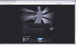
I whipped this up in an hour, it's kinda plain but functional and easy to manage.
Let me know your impressions. I like harsh feedback! :kali: :nads: :badputer:
intended audience: I don't do freelance/weddings/events, and I'm not looking for clients. I'm just making a webspace to share my stuff and let people know what I'm up to, and to get a customized email.