Cinematic Aesthetic.. is it impossible to see in your own stuff?

lol-43.jpg

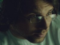
Hmm here's a 1 min mess up I did to show you an example mood. (ignore the crappy jpeg artefacts). With careful reframing, it's a strange close-up realisation scene where you're looking for something on the computer ;)

And cropped to 4:3, err, there's a belt for some reason on the left that wasn't exactly cinematic framing :)
 
I'm going to do some more practicing tonight. Is it feasible to be able to practice this stuff in my house or in locations I have access to without a story involved?
 
Joseph,

I think all your shots look reasonably cinematic, a few of them quite cinematic. At risk of sounding arrogant, I'll take the liberty of describing how I might adjust some of them (not that I'm all that great a cimematographer, but ...)

Starting with the 1st still: Use a flag or scrim to lessen the light on the pillow (it's competing for the viewers attention). The upper left of the frame is so dark, I don't know if that's a door jam or a light stand I'm seeing. So maybe just a faint bit of light there. Otherwise, I like it.

2nd still: Should I be looking at the trophy belt or at the man? They're both well lit. Lessen the light on one of them. Or maybe use slip-focus to redirect attention from one to the other.

3rd still: Good. But her left ear and jaw seem to be getting light from some mysterious source. It might look a little better (more dramatic) to reduce that with a flag.

4th still: This would be such a great shot if only that soda cup wasn't so darn bright. Use a scrim or flag here.

5th still: Nice CU. I wouldn't change a thing!

Vimeo link: On a few shots, your actors were casting double shadows. That calls the viewers attention to the fact that the scene has been "lit". (I know several old Hollywood B-movies did that, but we're making modern A-movies, right?) Generally, I try to avoid having actors cast any shadows on walls; it just calls the audiences attention to the lighting. Although in some cases, a shadow on the wall can have a very dramatic or horror effect.

OK, I've said enough. I'll shut up now. :)

-- Ken
 
Last edited:
Yeah, flags, scrims, nets, silks, dots and fingers to shape your light help a lot.

Also try to bounce of styro boards or 4x4s instead of soft boxes - makes a big difference.

Frank
 
biggest differences i see: the first set has a higher contrast ratio, considerably less fill, whereas the second set is much less contrasty across the subjects' faces. furthermore, the second set is graded much warmer, and while i like the look of the first picture in the first set the second picture looks kind of an ugly greenish/bluish cast that feels a little cheap/low budget.

maybe those are the factors you're thinking of?
 
Vimeo link: On a few shots, your actors were casting double shadows. That calls the viewers attention to the fact that the scene has been "lit". (I know several old Hollywood B-movies did that, but we're making modern A-movies, right?)

Take a look at some of Hitchcock's B&W, in particular, "Notorious"(1946), which has a lot of back wall shadowing, despite the very 'high key' light on Ingrid Bergman. But to be sure, that sort of thing would not fly these days...

For example, notice the shadow of the crystal glass on Bergman in this shot. (I couldn't find any with backwall shadows, but if one watches the film, one will see them often.). You will also notice that the shadows under the noses of Grant and Bergman 'go in opposite' directions...


notorious2.png
 
Last edited:
Great input guys.. the idea that you guys thought some of my shots were cinematic (even if they need some work) tells me that at least some of it is perception, and "being familar" with the scenery. It took me a while of watching my last feature before I was able to "see it" as a movie. Maybe part of it will always come down to the fact that we are always our own worst critics, and we see our own stuff differently that we see others, no matter how its done.
 
Take a look at some of Hitchcock's B&W, in particular, "NotFororious"(1946), which has a lot of back wall shadowing, despite the very 'high key' light on Ingrid Bergman. But to be sure, that sort of thing would not fly these days...

For example, notice the shadow of the crystal glass on Bergman in this shot. (I couldn't find any with backwall shadows, but if one watches the film, one will see them often.). You will also notice that the shadows under the noses of Grant and Bergman 'go in opposite' directions...


notorious2.png

Yeah, those films are what I had mind here (though this is just a wardrobe test and not a "real" shot).

Image4b.jpg
 
Well kudos to you for trying this all out. You'll be learning a ton from this and every time you shoot and light. Be creative. Be Different. Watch your stuff. It starts to make more and more sense.
 
I actually really like the first one of you on the bed. I'm a fan of the contrasty look when done right and I think you did a good job. I agree about the belt on shot number two. Where should I look? Some selective relighting in AE could help that. A trick I used to use if I wanted really soft light was to bounce lights off the wall opposite from where I was filming, if in a small room. Doesn't always work, but it can.
 
Before you can start making stuff that looks cinematic to you, you have to figure out what looks cinematic to you :beer: stare at such screen-grabs and figure out where the light's coming from, how the shot's framed, and how subjects are set in their environments. And practice practice practice. Basically what everyone else said.

Also, color-correction is too often overlooked and can make a huge difference.
 
Yeah, those films are what I had mind here (though this is just a wardrobe test and not a "real" shot).

Image4b.jpg


Hehe I actually like the harsh shadows and dated look. The Artist is bringing this stuff back in fashion I hope ;)

Working in B&W is just so much purer to check cinema than the distractions of color balance I think... that's quite a hard trick to master itself...

Here's something me and my chums did for our webisode series:


Heh. That's kind of in the spirit of what we're going to be doing. I like it!

Yes, it's quite a bit different than just shooting in color and turning it B&W in post.
 
My 2 bits.... I think your lighting is too "hard" you need to cut down that. Those stills were showing lighting that wasn't very dynamic. Its kinda harsh and then just dark. Nets, help.

Also what camera is being used? Your camera chip size and dynamic range will have a lot to do with a truly cinematic look. If you dont have enough dynamic range, your lighting will not hold up to look filmick.

Also, direction of the light is hugely important. But honestly if you're not really a cinematographer, you should leave this up to one anyway. Its their specialty and they will always protect your investment as a Director/Producer. Its good to learn, but also learn where your limitations are as a camera person. There are types of cinematic work I dont do simply because I know I wouldn't be the best for it, I'd leave that up to another dp or specialist for second unit to do if that comes into play.

The way I teach people lighting is to play around with it until it looks right, move the light around constantly checking the frame. Once you realize theres always a "sweet spot" for a particular light, then you'll understand better lighting techniques and how to light dynamically. Unfortunately I dont really think its possible to teach people the art of cinematography, its sort of "having the eye" that dictates how good someone will get.

Either way its nice to see someone being very objective to their own work and wanting to learn as much as possible. The craft and art of cinematography has been damaged a lot by the internet and cheap cameras, so its always good to hear someone wanting to push their look further.

Thanks! I'm starting to understand more, just by watching other stuff. I can see how my lighting is "obviously" lit.. where as most stuff I see, its "lit" but you aren't conciously aware of it.

I'm shooting with a Panasonic GH2.
 
Hehe I actually like the harsh shadows and dated look. The Artist is bringing this stuff back in fashion I hope ;)

Working in B&W is just so much purer to check cinema than the distractions of color balance I think... that's quite a hard trick to master itself...

Here's something me and my chums did for our webisode series:


My only 'critical' comments would be 1) the woman needs just a little bit more light... and 2) the guy would often not find the light, and and a portion his face would be in 'shadow', which didn't seem to be for a 'dramatic effect'.

Otherwise the dark, but detailed backgrounds were good...
 
My first tip is as some mentioned to light the set and environment first, with an idea of the persons in them. While I use them, terms like key, fill and backlight are NOT as easy as that. When it comes to natural lighting I would more speak about what I consider to be the different types of light:
1. Ambient light. This is what most people would see as a fill light, but to me it's function is more to provide a base of light and often the shadows in a contrast. Ambient light could be a light bounced in from another room to bring up the shadows, but in most cases it would basically by "non-directional" and as such needs to be VERY soft for it to work (I also enjoy to fill from below, but I'll get back to that).
2. Key/shape light. This light acts to bring up the shadows and give shape to the face. This does however NOT have to be the "main-light", providing most of the light. Oftentimes I prefer it to be the opposite: I expose for ambient, or fill light and use this light as a way of adding depth and contrast.
3. Fall light. By fall light, I basically mean an extension of the key, in that they fill the same purpose, adding shape, texture and depth to the shadows. Unlike the key however, they're smaller and might be from other directions. I consider backlight a "fall light", as a light can provide a nice fall on the back, creating a back and rim-light.

But secondly is to think about motivation in lighting. What are the sources? Ambient light is often that as I would dare to call it "source-less", as it should more keep up the general light in the room.
And then the key. A lot of the time, I can have multiple key-lights, with one being a fill to the key. A favorite technique of mine (that I picked up from my idol, Dean Cundey) is to add the fill from underneath the face. What that means is that the majority of the light would come more from up top, but to lift it, instead one would add soft light from underneath. The way I do it is to place a light fairly high and pointed down, giving the feel of a ceiling light (or sun if you're outside) and then adding a bounce from underneath (sometimes with a separate light pointing at it). While it sound odd, it feels very natural, as things like papers, tables or even sidewalks would bounce sources off and then provide a "fill". As such a key light placed this way would always have a fill in tandem, plus other lights.

For me, I often soften up the lights by bouncing them, sometimes just off a wall or ceiling, or maybe even from another room. Saves space, time and often money.
 
Back
Top