Blue is vulgar

I was wondering what you all thought of this quote by cinematographer Gordon Willis (The Godfather, Annie Hall, All the President's Men):

"I don't like blue in movies, especially period movies. I don't even like it in contemporary movies. I think it's a vulgar color on the screen. I don't hate it — I wear it — but I mean that on the screen I don't like it. I think it overwhelms actors and overwhelms the screen." ⸺ Gordon Willis Interview at AFI (1978)

I won't be surprised if most of you think he is too extreme. Even I think he is going off the rails, and I feel a certain similarity to his personality, as he and I are both minimalists.
 
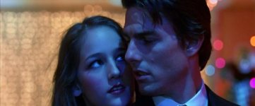
All of the color spectrum has a place in visual storytelling. It's up to the artist to use dabs of it in the right place. The one that gets me is green, you'd think green would look hideous but a large portion of my favorite
Jean-Pierre Jeunet films and Bill Pope's amazing work on the Matrix are green as hell. That's what proved it to me, you can use any color, anytime, if you have the chops to know when, where and how. That's the rub,
it's a thread-like fine line between bold visual innovation and completely trite shyte.
 
It's all context. Those shots look nice above, but then you have the early/mid 2000s thing with the aggressive looks/grades...your Underworlds, etc. But if you guys are really passionate about it, lobby your congressmen and try to get green made the complementary color of orange.
 
What an idiot. Assuming we're talking about cinema as art, it's eye of beholder stuff. In non art video it's a quite bold colour, it needs consideration and rejection/acceptance as appropriate. Sometimes these people just say crazy things.
 
Blue (or rather cold) is okay as long as you don't use those disco gels, or - at least - have it super motivated.

I just made a mood board for a feature film I gonna shoot in late September, lot's of blue there, but no vulgar.

Side note: That's the third feature, I gonna shoot exclusively on Blackmagic cameras ;-)

0.jpg
 
Last edited:
Interesting quote. I'm not sure I've ever thought of it that way before. It's a great color for science fiction and fantasy:

maxresdefault.jpg


sarahinsanelook.png


Terminator-22-700x300.jpg


As far as other genres go, he might be onto something. From an evolutionary standpoint, we're accustomed to seeing blue in the sky or a body of water. But outside of that, it's not the most common color to be found on land. Maybe that's why it could seem a little unnatural/jarring:

iu
 
What an idiot. Assuming we're talking about cinema as art, it's eye of beholder stuff. In non art video it's a quite bold colour, it needs consideration and rejection/acceptance as appropriate. Sometimes these people just say crazy things.

I agree. I think he's making a generalization about his personal preference.

I've worked with people who say they never, ever storyboard anything and have no respect for it. The Cohen brothers storyboard everything.

Which one of them is right?!?! :)
 
I agree it is a little funny. I was just wondering if any of you had been struck by it in that way, those of you who focus on this stuff every day.

I had not. In fact in graphic design, blue is a soothing color and is the fallback for businesses who want to be as inoffensive as possible (notice how often it is the main color on websites and logos). But I started to wonder, in the midst of skin tones, hey maybe it is subconsciously distracting. I don't know anymore!

Or are there any other peculiarities or rules you have come up with, even if you consider it your own style and not a universal edict?

---

By the way, he was talking about not the color of light but the color of objects: the costumes and set. Imagine a scene from The Godfather where in walks a woman in a bright blue dress. Willis would object. He was always trying to distill a frame down to its essentials and remove anything that was causing problems. I'm sure he got on the nerves the other department heads from time to time.

Also, although Willis was a bit of a grump with hypersensitivities, I think he was speaking about his own taste. He was reticent ever to give specific advice to others. When people asked him how he shot The Godfather, for example a cinematographer who was tasked with imitating it, Willis said, "You're looking for a formula. The formula is me. I just did what I liked." This is even though there are specific techniques he consistently used, not only in The Godfather, but in all of his films: soft overhead light, slight telephoto, formal compositions.
 
Last edited:
Color sets mood. One can have personal preferences, but emotional reaction to different colors is part of what is hard programmed into our visual cortex. In both theater and movies, thematic color palette selection is an element of production design, affecting choices of other elements such as costume design or set dressing that go far beyond just the lighting.
 
Back
Top