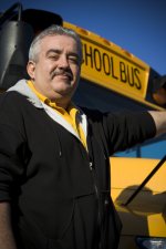
Before and After

Please feel free to contribute.


1202619979.jpg
1202620003.jpg
 
I like both - the second just has more of a richer, cartoony type feel to it. The original is great, but I like the edited one as well.

-Kegan
 
second has richer contrast and 'pops' a little more which I like but the flair on the bus is distracting and should be removed
 
Yeah I added the flare to take attention away from the color bleeding on the original. I Basically added a flare, masked out everything but his right side and lowered exposure and also added a type of sharpening. I am probably going to give the client the original with a little sharpening, not because its better but because the look I am going for is a more natural one.
 
I just has a little play with your original pic in Photoshop :)
 

Attachments

  • 1202619979.jpg
    1202619979.jpg
    218.2 KB · Views: 0
What filters or settings did you use to achieve such a vibrant image? Most of my images are dull....


your link isn't working for me. I basically added a little saturation and crushed my blacks slightly. Like I said before I left the face and right side of his body brighter than the rest of the pic so he stands out a little. My sharpening technique usually involves reduce noise, unsharp mask and different layer blending modes. I was just experimenting with this one but I normally would edit in 16bit color depth to avoid the posterizing that is apparent in the sky of the edited version.
 
I just has a little play with your original pic in Photoshop :)

I am probably going to do a mixture your type of correction along with a slight glare so that it doesn't look so flat. I just have to be exact with the stuff I do serious photoshop corrections with (such as clone stamping) since these are going to be 3' prints.
 
I´d also go with the first one sharpened and correcting the hotspot like Slinkii did...
Maybe blur the BG even a little more...
 
I would say the one on the right has better color, but the added flare is extremely distracting and competeing with his face. You cannot look at his face without seeing the flare, for that reason I would go with the one on the left as well.
 
I am probably going to do a mixture your type of correction along with a slight glare so that it doesn't look so flat. I just have to be exact with the stuff I do serious photoshop corrections with (such as clone stamping) since these are going to be 3' prints.


The Flare/Glare is visually distracting. your eyes go right to it and the rest of the photo gets lost. Remember warm colors "project", cool colors "recede" and since the bus is a "warm" color it needs to be even so you don't loose the guy in the photograph. Slinkii's redo is more visually pleaseing to the overall photo.
But then again, it all depends on what you are trying to "sell" in the photo too....
 
I think you are right I see how it is distracting.
I meant a glare that isn't going to look like a lens flare. Something that will look natural like a gradient of shades of yellow instead of just a flat yellow.
 
I appreciate all the great feedback but I didn't necessarily want this thread to just be about my before and after. Please post any if you got'em.
 
Back
Top