Another Logo design.

ryan brown

lOwEr CaSe Member
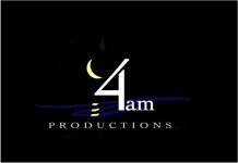
Yeah... I'm still working on it, and I think I may have finally come up with something I like.

Thoughts? opinions? change's?

Can you tell what it's supposed to be on first glance? (the abstract, that is)

logoplaymoon5.jpg


The drop shadow on "productions" will be a floating text, and I'll lose it on business cards and what not. Keep that in mind.

-brown
 
I think the simple colors translate well to multiple mediums. There does seem to be a lot of whitespace between the 4 and the moon. How does it look in B&W? With a white background?
 
I agree about the whitespace....I'd move the 4am a little bit closer to the yellow swish....which, looks like a wave by the way and Sorta like a cresent moon...

All in all, I like it though....I like the color palette...And I think its simple enough. I think simple is always VERY smart.
 
In my opinion, I like the essence of what you're portraying, but it just seems too busy (I think the drop shadow is too distracting). The fonts also look a bit too plain and uninteresting. The moon is great, however, and I think that's a good artifact to keep in there. Make it integrate more with the "4AM" text a bit more though.

EDIT: I think Ugafan's "4AM" font choice is cool.
 
Hmmm... thanks so far. Target audience is anyone willing to give me money ;) nah, music vids and higher end television commercials are the areas we'll be concentraing on for the next couple of years. I'll also be using the company (and it's logo) for all of my independent projects (shorts, docs, corporate vids, etc.).

I'm not crazy about Uga's font choice (but thanks for the opinion and effort)... for me, it take's the level of "profesionalism" down a bit. I like the idea of having very "structured" fonts, then the abstract to counteract the hard edges. Is this a graphic design "no, no"?

So, does everyone see that's it's a moon? do I need to make it less abstract? I'm a painter also, and sometime's my abstracts only make sense to me. I'd like people to see that it's a moon with a dark sky (the blue).

I'll pull it together a bit, as most people agree that there's too much dead space, and maybe I'll play around with some other fonts.

Keep 'em coming guys... it doesn't go unappreciated.

-brown
 
I saw the moon but you may want to make it slightly more cresent-shaped. (pull the bottom tip down and the top tip up.)
 
Well, I appreciate the abstract shape of the moon...it might be better received if it were more circular like the real moon. Just my take. My thinking is if you are doing a logo, why make 'em think.....?
 
I agree the moon shape isn't quite moon-shaped enough to be immediately obvious. My first glance at the logo read it as C-4am. I know what C4 is...but C4am?...then I got the moon & water image. I suggest a solid crescent or outline crescent (no jagged fill as you have now) with your original fonts, minus the drop shadow. If you can work a simple reflection into the water using the moon's color, all the better.

Something like this, but with your hand-drawn moon.
 

Attachments

  • 4am.jpg
    4am.jpg
    49.1 KB · Views: 0
Oooh... I really like the reflection idea. I'll pick it up again tomorrow, and thanks for that.

-brown
 
I knew immediately that it was a moon, but it also looked like the moon was spelling out C 4.

The smaller moon, above, helps; or my initial thought was to mirror it so the opening of the crescent is away from the 4 (a backwards "C").

Just a thought. Otherwise, great job :thumbsup:

Peace,
Larry
 
With this logo, I'd say just scoot the moon a bit to the right. But leave the 4am off center.

Are you doing these yourself? I know a couple art directors around town who would probably be willing to help. Although they might also want (a little) money, too. :)

When looking at production companies, I've noticed the really good ones either have very simple logos (usually just a slightly modified font) or something kind of cutting edge. Bad logos generally don't bold well for what's inside the DVD case. That's just my obvservation, though.
 
I'd nest the "4am" inside the moon, lose the blue swipes, drop the shadow, and go with a different typeface (imho).
 
Back
Top