fight scene from "WRATH" shot with LETUS

allahkaram

Well-known member
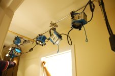
This is a fight scene for a trailer I shot for a short called "WRATH" which is still in works. We created a Rig to mimic Casino Royale lighting style for the opening sequence. They chopped the ceiling and installed a giant soft box and blasted light through it and I piled up bunch of Gobo-arms on C-stands to DARE their sequence. I pointed the 600s on the walls and the 300s on characters to create high contrast, plus characters were wearing dark tones as well.

http://www.youtube.com/watch?v=_64czo2burs

It was shot on HVX, Letus FE, 24mm mostly with 50mm.

Sound Design in protools.

Feel free to leave a comment.

ENJOY
 

Attachments
  • DSC_0023.jpg
    DSC_0023.jpg
    114.9 KB · Views: 0
Last edited:
I don't think the high contrast look worked very well. The walls are overlit to the point where it's hard to see. I can see areas that weren't evenly lit and those are kind of a dirty gray. The actors themselves were just blasted with lights and they're wearing black clothings so once you crush the blacks (too much) they just fade right into the dark area of wall (like the guy that came through the door) and their blown out skin fades into the bright part.

But the main thing is just that the fight lacks intensity. I can see instances where one person stops and wait for the other to hit him or anticipate the opponent's move before they actually make it. It just feels like two people sparring instead of a life and death match. The SFX for me was unconvincing as well.
Can you elaborate why the sfx is unconvincing for you? And the reason why there's not enough detail in the picture is because that was the whole point. I wanted to keep it like a painting (abstract) where all you see is two shadows fighting (not literally). It suppose to be an unsual dream-like sequence that's why its light and cc off the wall.
 
I went to look at the fight sequence and other work you've done. I like it from a filming point of view (stylistical/story/concept opinions removed).

It seems to me you prefere CU/XCU and Medium shots more than wide shots, so sometimes it's hard to follow what is going on and where.


The fight sequence had a "Jason Bourne" hand-held feel to it, including the weapon pickup (happens in the first film with a pen.), but you may need to include some wider, less tight shots for people to follow the action.

Other than that, the pace of the clip is fairly good and fast, i don't know what ramps into it, or out of it to tell if it would fit in the over-all sequence.
 
I agree with Huy Vu that the exposure is way too overwhelming. sometimes I can't tell what's going on. good sound, though. I like the sound of the knife going into the guy.
 
Thanks for the input guys. Appreciated. And yes I agree sometimes I go over the board with cc. And yes the reason why I did DISTURBANCE was because I'vent had outdoor, wide landscape photography experience and I think I did quite well.
 
Back
Top