

fevercity
Well-known member
Nope. Not James Bond. Long before Pierce Brosnan took his turn as 007 in '95, John Huston released a very strange film in 1967, "Reflections in a Golden Eye" starring Marlon Brando & Elizabeth Taylor.
I used a Smead UltraColor Envelope 89532 (BLUE this time) for WHITE BALANCE. Add some adjustments in-camera and you've got a cheat on this weird look.
"To emphasize the film's psychological oppressiveness and find a visual equivalent for the novel's brooding, interior spirit, Huston," according to Tony Thomas in The Films of John Huston, "evolved a costly and complicated process of desaturating the film's color until only a gold and slightly pinkish image emerged. [Cinematographer Oswald] Morris called the effect on the film's mood "quite extraordinary." Warner Brothers didn't agree, however, and released the film in full Technicolor, which made the film pictorially striking and quite beautiful to look at, but decidedly worked against the emotional impact Huston wanted Reflections to have."
"GOLDEN EYE"
(need Smead 89532 or weird blue for white balance)
DETAIL -3
V. DETAIL LEVEL -3
DETAIL CORING +3
CHROMA LEVEL 0
CHROMA PHASE -7
COLOR TEMP +5
MASTER PED -5
A. IRIS LEVEL -2
GAMMA B.PRESS
KNEE HIGH
MATRIX NORMAL
SKIN TONE DTL OFF
V. DETAIL FREQ THIN
PROGRESSIVE 24P
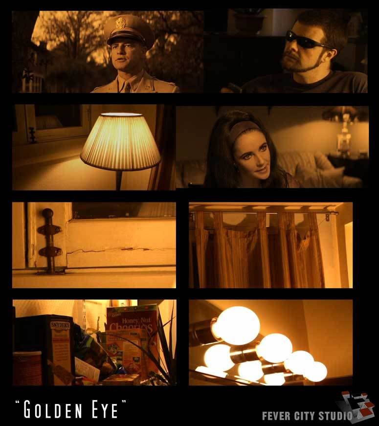
"Warner Home Video recently released Reflections in a Golden Eye as a stand-alone DVD and as part of the Marlon Brando Collection boxed set, and the picture looks the way Huston originally intended. The anamorphically enhanced presentation restores the picture’s widescreen aspect ratio, and Warner Home Video has seen fit to add the golden sheen back to the image — a disquieting visual detail that only adds to the film’s strange, tension-filled narrative."
Why would you want to use this? I have absolutely no idea.
Why did I do it? Well, I had the envelope and a little too much time on my hands it seems.
Warner Brothers hated it, maybe you will too......
Fever City Studio, Denver, CO
I used a Smead UltraColor Envelope 89532 (BLUE this time) for WHITE BALANCE. Add some adjustments in-camera and you've got a cheat on this weird look.
"To emphasize the film's psychological oppressiveness and find a visual equivalent for the novel's brooding, interior spirit, Huston," according to Tony Thomas in The Films of John Huston, "evolved a costly and complicated process of desaturating the film's color until only a gold and slightly pinkish image emerged. [Cinematographer Oswald] Morris called the effect on the film's mood "quite extraordinary." Warner Brothers didn't agree, however, and released the film in full Technicolor, which made the film pictorially striking and quite beautiful to look at, but decidedly worked against the emotional impact Huston wanted Reflections to have."
"GOLDEN EYE"
(need Smead 89532 or weird blue for white balance)
DETAIL -3
V. DETAIL LEVEL -3
DETAIL CORING +3
CHROMA LEVEL 0
CHROMA PHASE -7
COLOR TEMP +5
MASTER PED -5
A. IRIS LEVEL -2
GAMMA B.PRESS
KNEE HIGH
MATRIX NORMAL
SKIN TONE DTL OFF
V. DETAIL FREQ THIN
PROGRESSIVE 24P
"Warner Home Video recently released Reflections in a Golden Eye as a stand-alone DVD and as part of the Marlon Brando Collection boxed set, and the picture looks the way Huston originally intended. The anamorphically enhanced presentation restores the picture’s widescreen aspect ratio, and Warner Home Video has seen fit to add the golden sheen back to the image — a disquieting visual detail that only adds to the film’s strange, tension-filled narrative."
Why would you want to use this? I have absolutely no idea.
Why did I do it? Well, I had the envelope and a little too much time on my hands it seems.
Warner Brothers hated it, maybe you will too......
Fever City Studio, Denver, CO


