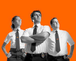
New Logo. New company. Opinions please.

insanityfw

Ban Me Please!
Hello everybody,

I've had my old production company chugging around since the late 90's since I finished my first and last feature. I haven't really been doing that much since then, but have been building up small projects here and there.

I figure that from an emotional standpoint and a tax perspective it would be best to just throw away the old company (no matter how dear to me it was) and start fresh.

I'm not really a graphic artist, but I was scouring for stock photos and came across an image that was pretty cool to me. Simple, old-school stuff, just like me. I used it as the basis for my new company name and logo.

I selected the name, BLACK SUIT STUDIOS for a couple of reasons. The main reason was to have a name that I could hang a few artistic businesses working under and STUDIO works for art and entertainment. Right now I design custom homes and do 3d models of homes as my living as well as dabble in filmmaking, which will grow in importance over the next few years. So, the name needed to be more of a shingle to work under.

Also, I think the irony of a simple black suit describing artistic things is a nice touch.

I have spent years thinking about this, but when I saw the image I just decided to go for it, so the name was dreamt up and the image modified....and this is how it came out.

Let me know what you folks think.

One thing for sure is that it will look pretty cool embroidered on hats and sweatshirts. That's important, you know. :)

Thanks,

Jason

http://www.dvxuser6.com/uploaded/3378/1166935342.jpg
 
Last edited:
Looks a hell of alot like the Geeksquad ads.
Ill find one if i can.
geeksquad.png
 
yeah it sort of does (I've never seen those ads before)...maybe Resevoir Dogs too...from what I can remember.

I'm just a one-man show, so I'm sure any minor resemblence to something else can only be good.

Thanks for posting that.
 
I think your logo is cool, but i looked at it for a min and knew i had seen it somewhere before.
 
Thanks. I had the same feeling with the RED camera logo. I was surfing stock photos for another project and came across the base image that they must have used.

At least now, i only see it as a RED logo. :)
 
That's pretty cool to me, Jason.

I might prefer a bit deeper red, though. That one there looks a little too pinkish for my taste. But I like it. Maybe it could use a little something above their heads that follows the contour of the curve that their heads form. Does that make sense? I don't know what it would be though.

Later,
Jason
 
Thanks guys. I will have to check out the band apart logo. Don't want to be too similar to another film company.

Jason, I thought I had used a deeper red, but maybe I should figure out how to calibrate my monitors, because I know they're not accurate. I definitely don't want pink. :)

Thanks again.
 
Man, my logo looks different, but at the same time, just the same as the black and white image from Resevoir Dogs. At least at first glance it looks the same.

Hell, I'm not really sure if I care that it looks similar. I'll see what I can come up with like Jason said....need to make it looks as dissimilar as possible. However, if it's pisses Tarantino off that could work in my favor. I always said that I wouldn't get famous making movies, but rather for punching T out in a bar during Sundance. :) I mean if the guy can make all his movies as remakes of obscure Asian movies then certainly I can use a logo that looks a bit like his, right? :)

Ooops, there goes my holiday spirit. I retract the previous, negative statement. :)


HoHoHo
 
insanityfw said:
Man, my logo looks different, but at the same time, just the same as the black and white image from Resevoir Dogs. At least at first glance it looks the same.

What's the deal about potentially ripping off Reservoir Dogs anyway?
Reservoir Dogs rips off some very nice shots by Seijun Suzuki. Or at least, these seemed 'very familiar'..... Check out Tokyo Drifter if you haven't.
 
While I certainly understand the arguments here, and I realize the OP is saying some things in jest, I would advise to try as hard as possible to not look like you are "ripping off" another existing production company, especially Tarantino's. With everyone trying to jump on the Tarantino and Rodriquez syles after Dogs, Pulp, and Mariachi, I personally think it would look a little pathetic to make a Tarantino clone logo, especially if you cant create Tarantino quality flicks.

I like your logo. I think it would have been cool if A Band Apart didnt exist. It sucks, but I think you should bite the bullet and redesign.

Considering the similarities, I'm slightly curious where you got the "Black Suit" idea from.

Another thing I thought was cool at first, but amnot a fan of now, is "Slide" productions here on the boards. Fincher is my favorite director and Fight Club is easily in my top 3, but the Slide penguin can only come back to bite, IMO.

Just my thoughts, and I'm just an unimportant guy.

-GageFX
 
Thanks again guys and merry christmas.

I'm very aware of Tarantino, because I came up in film school when everybody was trying to mimic him and then to find out later that most of what he does is mimicing somebody else as Herman mentioned. So again, it's not that I want to clone anything Tarantino does. As a matter of fact I have paid such little attention to him over the years that I didn't even notice that his logo was the pic from Res Dogs.

Gage, I actually came up with Black Suit Studios after seeing some vector artwork on a stock photo site that I thought was cool. So, I bought the art and did only a minor bit of working on it, just to get me moving in the right direction.

In all fairness I don't really think the art is a rip off of Tarantino, because I'm sure that in the history of photography, etc. there have been many pictures taken like this. The guy that does the pic actually has a whole series of people in lots of poses and then he takes them a silohuetes them. I'm sure that there are a ton of pics of the Rat Pack taken like this....that's probably where it came from in the first place.

It's just unfortunate that the idea I came around to is so similar to somebody as prolific as Tarantino. Oh, well.

I'm going to be kicking this one around for a long time because I really like the logo now.

I guess I could go back and revamp the old, faded Insanity Filmworks I've been carrying around for a while.

Thanks again.

Jason
 
Where did you get "Black Suits" from? What does it mean to you? Maybe there is another design that can convey the same vibe without looking too Tarantino.

If it is just that you saw the vector art and liked it, there might not much to delve into there. If you can try to express the feeling you want to convey with your company name, (if any), I'm sure many here cn help out with ideas.

-GageFX
 
insanityfw said:
Thanks again guys and merry christmas.

I'm very aware of Tarantino, because I came up in film school when everybody was trying to mimic him and then to find out later that most of what he does is mimicing somebody else as Herman mentioned. So again, it's not that I want to clone anything Tarantino does....
Jason

Sigh :undecided :thumbsup:

I wouldnt rely on Hermans take.
=

For what it is worth; I don't think it looks anything like A Band Apart

It looks more like some Rap Gangsta thing; all that is missing is some bling
 
That's pretty harsh, John. But I think it's right on the mark. Something bothered me about it but I couldn't put my finger on it. I think you have.
 
Rap Gangsta thing? I don't see that, but it's an interesting take. :)

It's really interesting. Even putting out something as simple (comparatively) as a logo and having people critique it gives me the same feelings that I get when people critique my film work. I guess I'm going to have to go back to therapy to toughen up. :)

I think it also comes down to self-confidence. I started thinking "OK, I don't think it really looks that much like A Band Apart, so I'll continue to work on it as is, then John and Blaine say it looks like a Gangsta Rap logo and I start to waffle again.

So far I'm going to move forward with it, but I'll continue to chew on what people are saying.

Thanks again. I do listen to what's being said and appreciate it, yo. :)
 
Hey, it's just the take of a couple of people. If you like it, that's what's really important. You could come up with anything and it's not going to please everyone so you need to take peoples' opinions with a grain of salt. I couldn't put my finger on what was bothering me about it, but when John voiced his opinion, it hit me. The fact that I didn't latch onto it myself, certainly leaves the door open that I've misinterpreted it.
 
I like it. It's simple and intriguing. I would click the 'enter' button on a website with this logo on the front page.

Good luck.
 
Thanks again guys.

Blaine, you're right about it being the opinion of a couple people, but I think that normally I do things and try to avoid getting opinions, but I've become so comfortable on DVXuser that the views of others here mean a lot more to me than normal.

Alvarez, I'm glad you like it. Simple design is usually the most complicated, which is what I like about it.

I'll continue to think about it.
 
Back
Top