Photography Tutorial - Rule of Thirds

Jeremy Ordan

Major Contributor
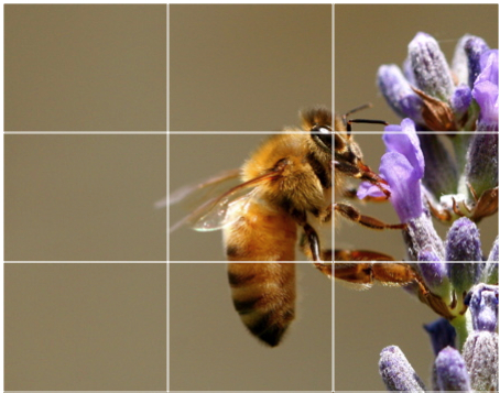
For 11 weeks now I have been checking out the images posted for our weekly contests and the one criticism I offer more often than anything else is: look into Rule of Thirds.

Essentially the rule of thirds says that your action or focal point should fall on a division of the frame. This is sort of counter to what most people try to do with what I call the 'Vacation Photo'; where your subject is in the dead center of the image. By using the rule of thirds you add drama, tension, and an overall more pleasing effect to your image and it is as simple as composition.
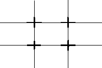
fig1.gif


Here is a better definition I stole from wikipedia:

The rule of thirds is a compositional rule of thumb in photography.

The rule states that an image can be divided into nine equal parts by two equally-spaced horizontal lines and two equally-spaced vertical lines. The four points formed by the intersections of these lines can be used to align features in the photograph. Proponents of this technique claim that aligning a photograph with these points creates more tension, energy and interest in the photo than simply centering the feature would.

The photograph to the right demonstrates the application of the rule of thirds. The horizon sits at the horizontal line dividing the lower third of the photo from the upper two-thirds. The tree sits at the intersection of two lines, sometimes called a power point. Points of interest in the photo don't have to actually touch one of these lines to take advantage of the rule of thirds. For example, the brightest part of the sky near the horizon where the sun recently set does not fall directly on one of the lines, but does fall near the intersection of two of the lines, close enough to take advantage of the rule.

The application of the rule of thirds to photographs is considered by many to make them more aesthetically pleasing and professional-looking. The rule of thirds can be applied by lining up subjects with the guiding lines, placing the horizon on the top or bottom line instead of the center, or allowing linear features in the photograph to flow from section to section. In addition, many photographers recommend treating any "rule" of composition as more of a guideline, since pleasing photographs can often be made while ignoring one or more such rules.

fig2.jpg


561_1.jpg


200605022117.jpg


By applying these concepts to your personal projects you will not only see better, more professional images, but also be able to control your audiences eye and direct them where you want in your image.
 
While the "rule of thirds" applies pretty well to most aspect ratios nearer academy, I feel that it is somewhat less true (mostly in the horizontal axis) with wider frame (2.35:1 and above). For these compositions I usually think in terms of a frame divided into 4 equal parts in the horizontal axis.

This is of course very subjective, but I would be interested to learn how others handle very wide aspect ratio framing?

Below is an example of "my approach" to framing wide aspect ratio shots. This is from a location scouting trip I did last weekend.

1163694022.jpg
 
Last edited:
I was just trying to teach the rule of thirds to my 8 year old daughter the other day.

I'm going to show her your sample photos tonight.

Chris
 
khmuse said:
While the "rule of thirds" applies pretty well to most aspect ratios nearer academy, I feel that it is somewhat less true (mostly in the horizontal axis) with wider frame (2:35 and above). For these compositions I usually think in terms of a frame divided into 4 equal parts in the horizontal axis.

This is of course very subjective, but I would be interested to learn how others handle very wide aspect ratio framing?

I completely agree with that sentiment. With panoramic (which 235 certainly is close to) the division is more to a 4/3 system. Looking at the above image and the intersections, the horizon and mountain are still pretty close to the 3rd markers, so it comes off nice and balanced to my eye.

I think it relates then to this image on the vertical third:
third.jpg


CMessineo said:
I was just trying to teach the rule of thirds to my 8 year old daughter the other day.

I'm going to show her your sample photos tonight.


Cool, I hope that it works for her. I have a couple of these tutorials in mind and hope they are just like the weekly contests... helping people to become better photographers and cinematographers.

If you read this thread though, you will have a massive clue as to what the theme is of round 13.
 
I agree with the vertical division into three equal sized spaces, but as I said, for wider aspect ratios, I use four equally spaced horizontal areas.

Now if I could only get my ground glass remarked for "my" framing approach, it would make my job easier. Right now, I have to mentally create the framing keeping in mind the post cropping that I will do for site selection images when location scouting.
 
Jeremy Ordan said:
For 11 weeks now I have been checking out the images posted for our weekly contests and the one criticism I offer more often than anything else is: look into Rule of Thirds.

jack_sparrow270.jpg


"... well, more like guidelines, really."


Seriously though. Nice tutorial Jeremy. I completly agree how many of the photos in the contests could be so so much better with just simple improvements to composition.

- Mikko
 
khmuse said:
I agree with the vertical division into three equal sized spaces, but as I said, for wider aspect ratios, I use four equally spaced horizontal areas.

I agree about the fourths for the wider aspect stuff on the horizontal plane but still the thirds on the vertical. Sorry, I should have made that clearer...
 
Hey were all on the same page on this subject.

Cool!

Anyone else have a technique that they want to share on wide framing?
 
I guess I just go with whatever feels right at the time. More times than not, my composition falls into line with the guidelines explained above.
 
2046framefq8.jpg


Or you can be Wong Kar-Wai and follow the 1/5th or 1/8th rule. His framing in 2046 and In the Mood for Love was very far off from center, but works extremely well to draw your eye to the subject.
 
Tom Lowe said:
2046framefq8.jpg


Or you can be Wong Kar-Wai and follow the 1/5th or 1/8th rule. His framing in 2046 and In the Mood for Love was very far off from center, but works extremely well to draw your eye to the subject.
Bad example though. I mean what else does one look at in this still? Beautiful Asian woman with naked neckline.. -or- out of focus background. It'd be hard to get the attention off of her even if she were hiding behind one of the perfume bottles. Or maybe an example of pure genius... as I look again I really am drawn to see what's reflected in the mirror probably for a back view, which then bounces my attention back to the subject again and again.
 
I prefer to compose WAY off center. i like the edges of the frame/Canvas/paper/wall/ gallery etc... i HATE when things are perfectly 1/3 1/3 1/3...


Also, i cant believe ive been absent form the Still photgrapy forum.....
 
Back
Top