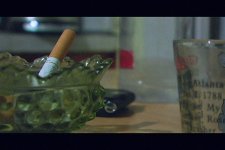
Frame Grabs with CC critique please?

ZombieSquid

Well-known member
Here's one, I'll get a few more up soon. These are from a new short in progress. Thanks for any criticism/critiques in advance.

THNX

beforecc.jpg


aftercc.jpg
 
Last edited:
Ok man, your cc is good but its lacking a bit...here is a comparison for you to ponder...this is all subjective but hell, i'll have fun with it.

Your original
beforecc.jpg


Your CC
uraftercc.jpg


My rendition of CC
myaftercc.jpg


Maybe it's nuiance stuff, i dont know.
 
Truthfully, i prefer the original cc. With your cc the highlights seemed to get a tad washed out, and there looked like there was a reddish hue going on...However for the original it looked greenish
 
well, like i said, its all subjective...truthfully though, you cannot really come close to film on video without occasionally washing out some highlights. I mean, playing it too safe isnt going to work because video has too shallow of a contrast range compared to film. I personally think the original looks very low contrast and video like.
 
how about this one?

it's much more subtle than the other versions. but i think it has a film like appeal. also added a slight amount of film grain. not everyones thing i know but i work in film and seeing images without grain to me looks kind of weird.
 

Attachments

  • cc.jpg
    cc.jpg
    303.1 KB · Views: 0
I think it has a filmish quality.

but i am really curious as to why people on here, not saying you akj, seem to confuse the look of true film with the look of film being telecined back to video. I have yet to see any DVX footage on here that resembles film stock look. At most it looks like NTSC broadcast converted film. Sortof like made for TV movie stuff.
 
For instance, this is a grab of real Super 8 film baby...YEAH!

film.jpg


I have never seen anything DV on this site (or any other DV filmmakers portal) that looks as gritty good as even this simple mediocre shot Super 8 frame. And when you are talking projected film stock look, its like this baby (for low budget)
 
MalcolmOng said:
Truthfully, i prefer the original cc. With your cc the highlights seemed to get a tad washed out, and there looked like there was a reddish hue going on...However for the original it looked greenish


Meet it halfway. The original looks a little flat, but only needs suttle changes in my opinion. both cc's look a little to artificial, like your trying to hard to get it to look like film. Maybe crush the blacks just a tad, but try to keep the highlights as they were in the original. OF course this is just an opinion and preference
 
Brandon were you going for sort of a stylized look? If you were going for neutral and just enhancing, then it seems to have a lot of a greenish/yellowish tint to it.
 
I was going for a green hue stylized look myself, bballplaya283's looks killer.Ii like it. What did you use? I like Brice's gritty yellowish one too, it would do well in a really slimy stylized nasty kind of scene.
 
Back
Top